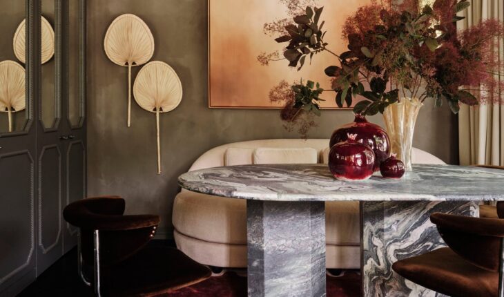
Every once in a while we get a DM or email about an amazing space to potentially publish on the blog. So when we got a message from Smac Studio, an Australian design firm, it was an immediate YES! Their work is stunning. Take a peek at more of their projects here. And while the majority of us aren’t in need of a design studio makeover, there is so much inspiration to gather from this space. Principal of Smac Studio, Shona McElroy, designed this whole space in TWO DAYS and completed it in TWO WEEKS. Let’s all take a second to collectively pick our jaws off the floor. I really need to take a page out of their book. Actually, maybe I’ll just take the whole book:) One thing Shona said that I loved was that when designing any space, their first concept is the best and this studio/office was a testament to that. A true reminder that trusting your gut usually pays off. Ok, ready to see the befores??
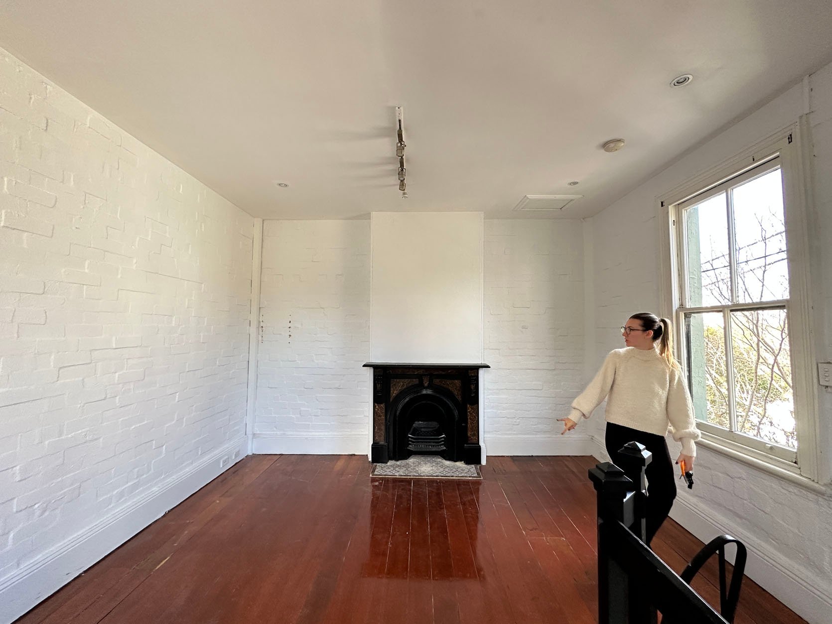
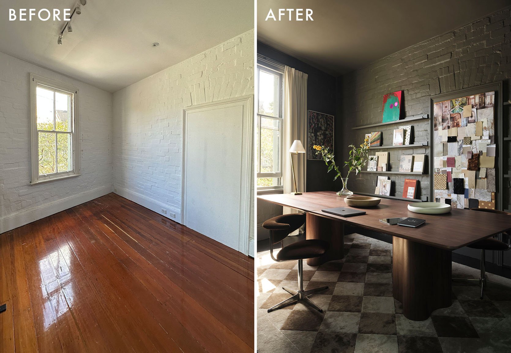
Even seeing the hundreds (and maybe thousands at this point) of before and afters, I am still amazed at the power of design and transformation. I know you’ve only gotten a sneak peek of the after in the opening photo but my god are you about to be wowed.
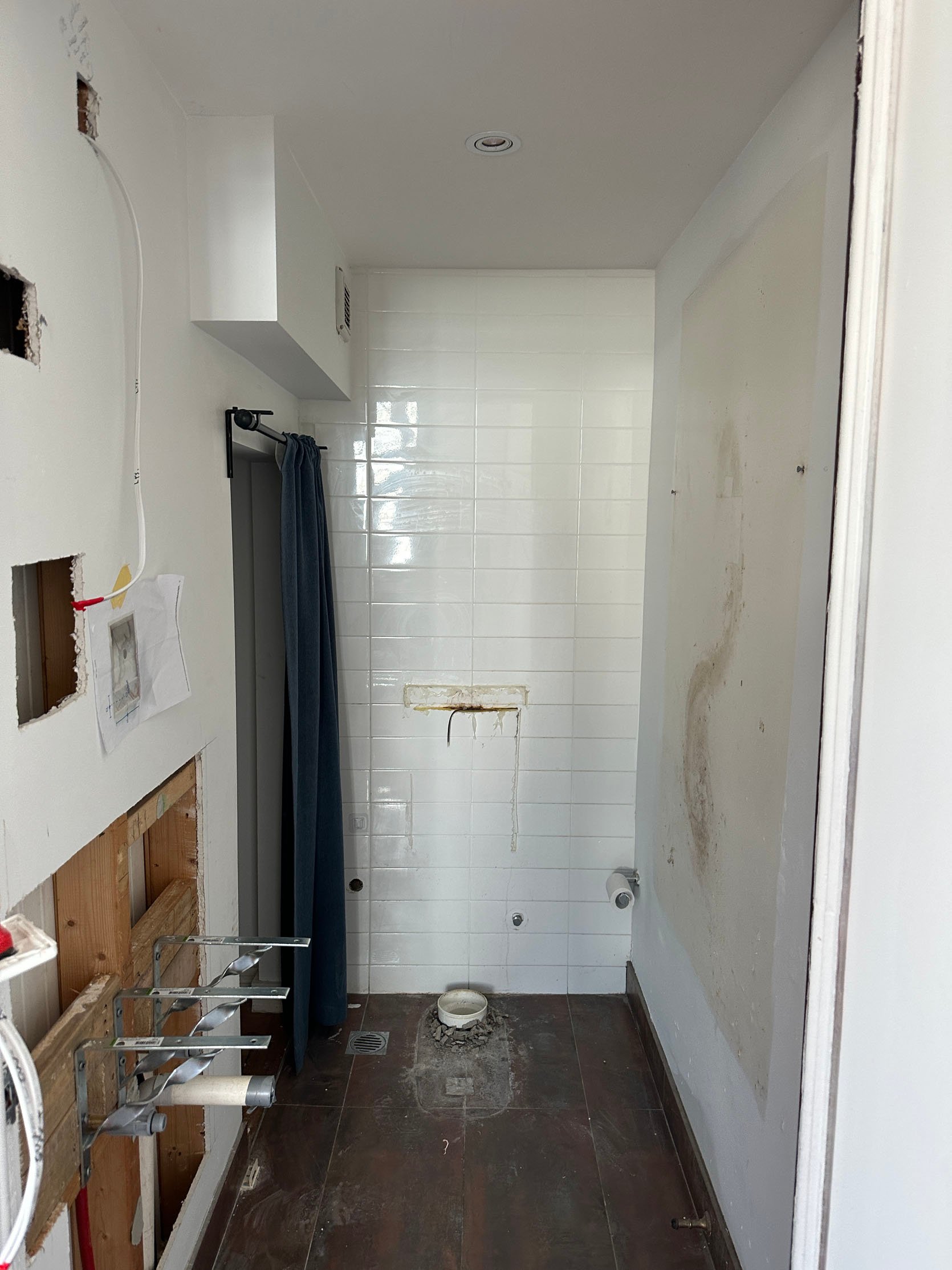
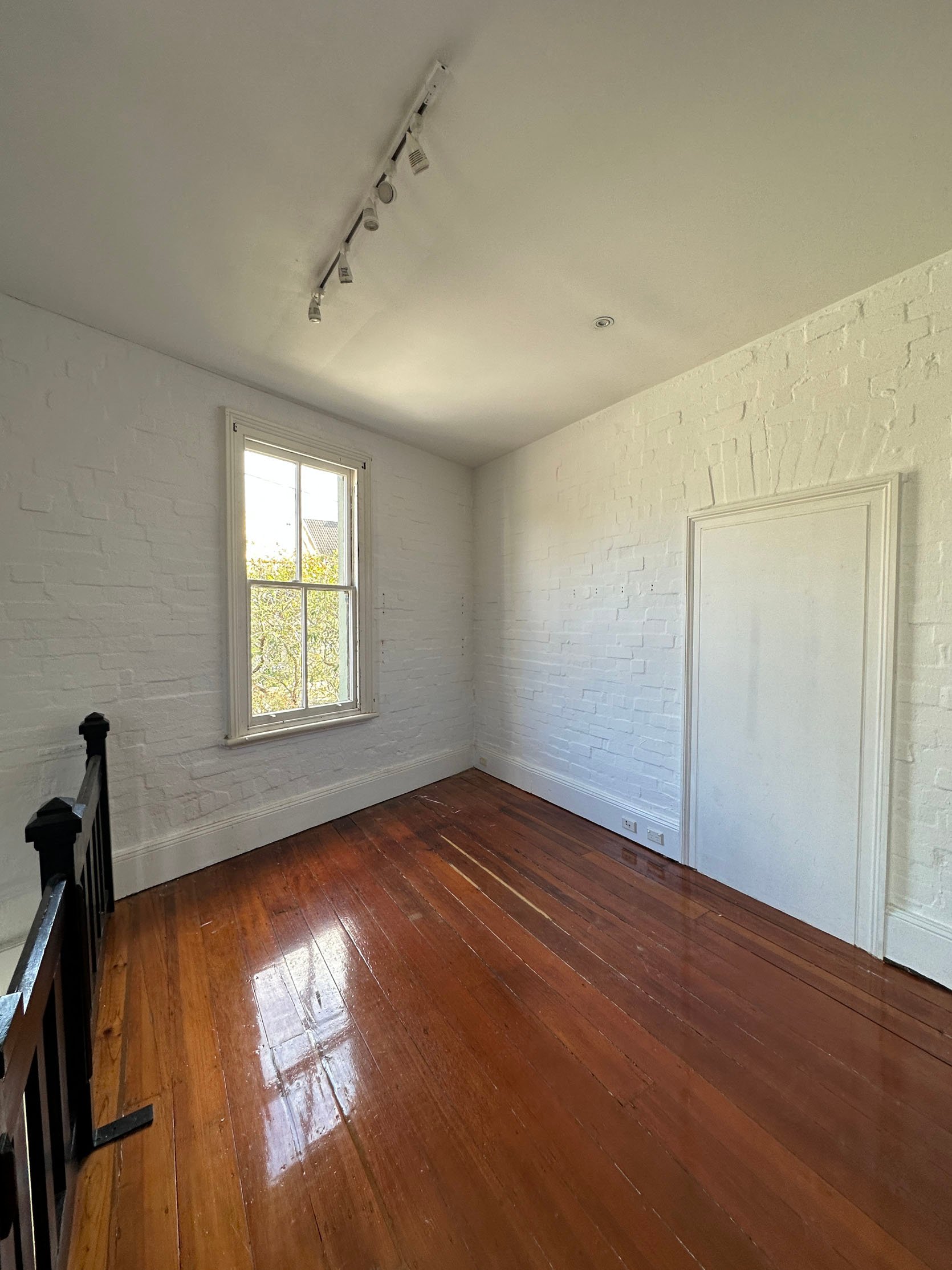
This building is 100-plus years old and very much resembles the Victorian terrace-style homes in the Paddington, Sydney area where it’s located. Fun Fact! As a commercial building, it previously was the home to a jeweler, a florist, an organic food store, and more. Basically, this baby is rich in history and it was time to bring it back to life as well as be a showcase of their firm’s aesthetic.
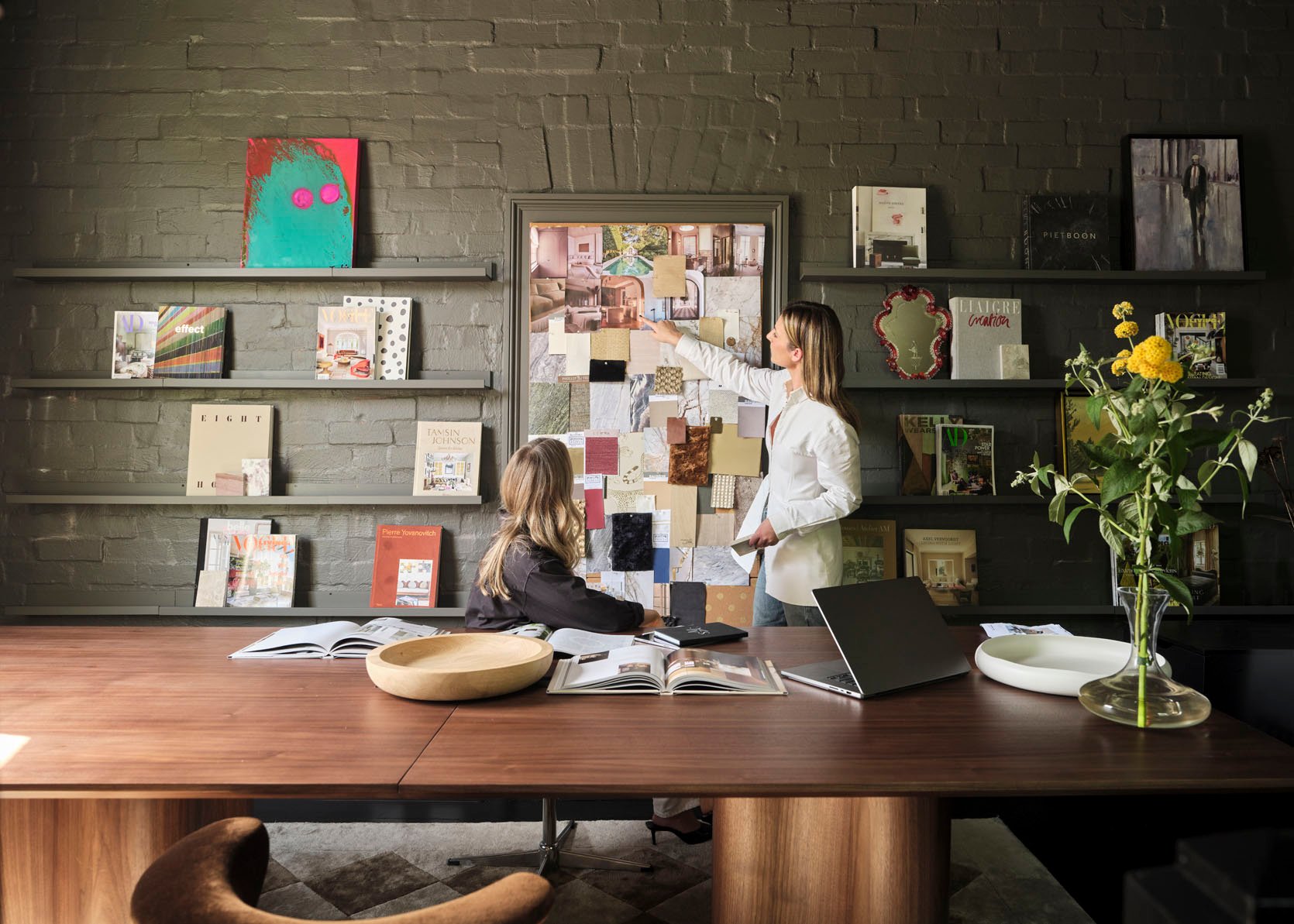
And with some beautiful paint (and beautiful decor pieces), a design studio was born. Oh, and I forgot to mention that this two-story space is only about 538 sq/ft in total, 269 sq/ft per floor! Small space maximization was definitely a top priority which I’ll get more into in a minute. But as for the photo above, I’m a die-hard long art-ledge fan. I think they are so elegant and practical for say, the indecisive designer (like myself). Of course, for a design studio, they are extremely practical for displaying ever-changing art, mood boards, etc but that’s also why they are great for a home. It’s such an easy way to be able to showcase your beautiful art and then switch it out for a fresh new look. The best part is that you don’t have to make any unnecessary holes in your wall. I was just at a friend’s trying to nudge her into installing one but maybe I just should do it in my home. Actually, why haven’t I done that yet??
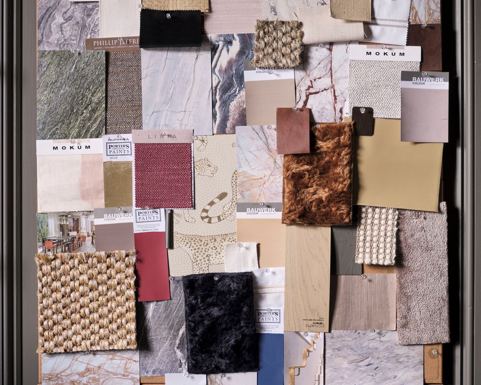
I had to include this photo because it’s just beautiful. I love a real-life mood board so much.

But back to the office design. The mood board you see is actually a covered-up doorway that once connected this building to the one next door, which they happily took advantage of. What a smart way to use what you’ve got. Also, the dark green color choice was important to the Shona to not only create a slightly unconventional color palette for the space but also to make it feel grander (remember each floor is just north of 250 sq/ft). Like Emily, Shona feels that painting a room white won’t always make it feel bigger. Instead, choose a deep, warm tone and add decor like mirrors to help bounce the light around. That’s going to make the space feel bigger. This is also a smart move for a design firm that can show in person a bold color is a great choice.
Oh, and that beautiful rug was designed by Shona with the Australian rug brand, Hali! From what I can tell they only ship within Australia but I could be wrong. Regardless, have a look because all of them are gorgeous.
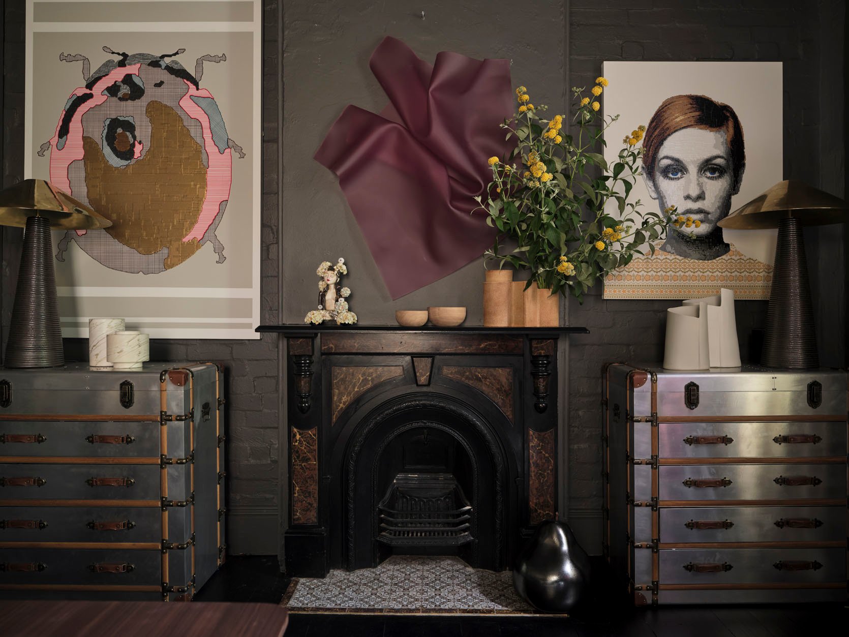
As you saw in the before photos, this fireplace was already there which adds a ton of character (the dream) and those aviator-style chests are a great style contrast (that also gives them a ton of sample storage). Win-win.
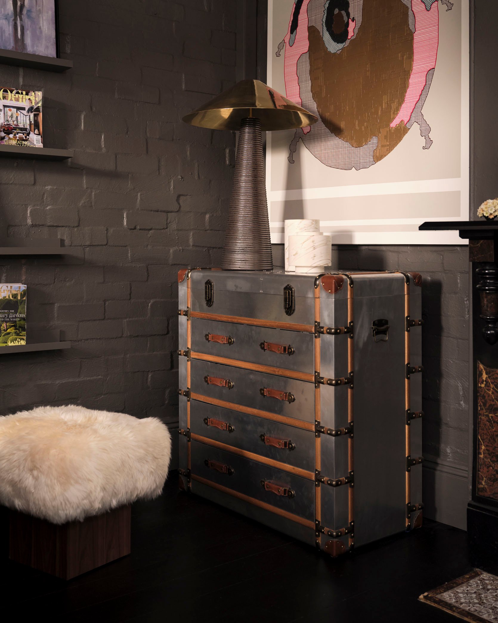
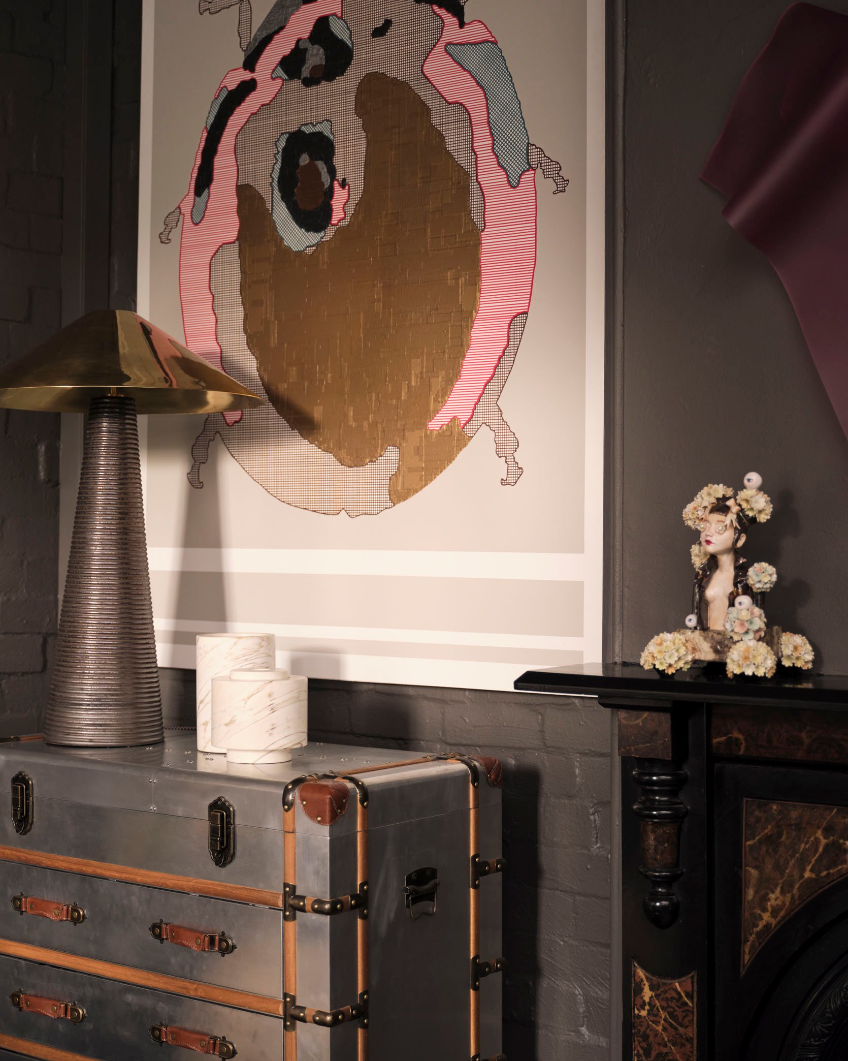
One tip for small-space designing is to play with large-scale pieces. I know it seems counterintuitive and that you’d want to get only small pieces, both furniture and decor. And of course, you don’t want everything oversized so that your home feels completely overcrowded but pick moments where you go big. Art is definitely the easiest, and in my opinion, is guaranteed to make your room feel bigger and make you look like a design pro. I have the oversized piece of art to prove it. So another win-win.
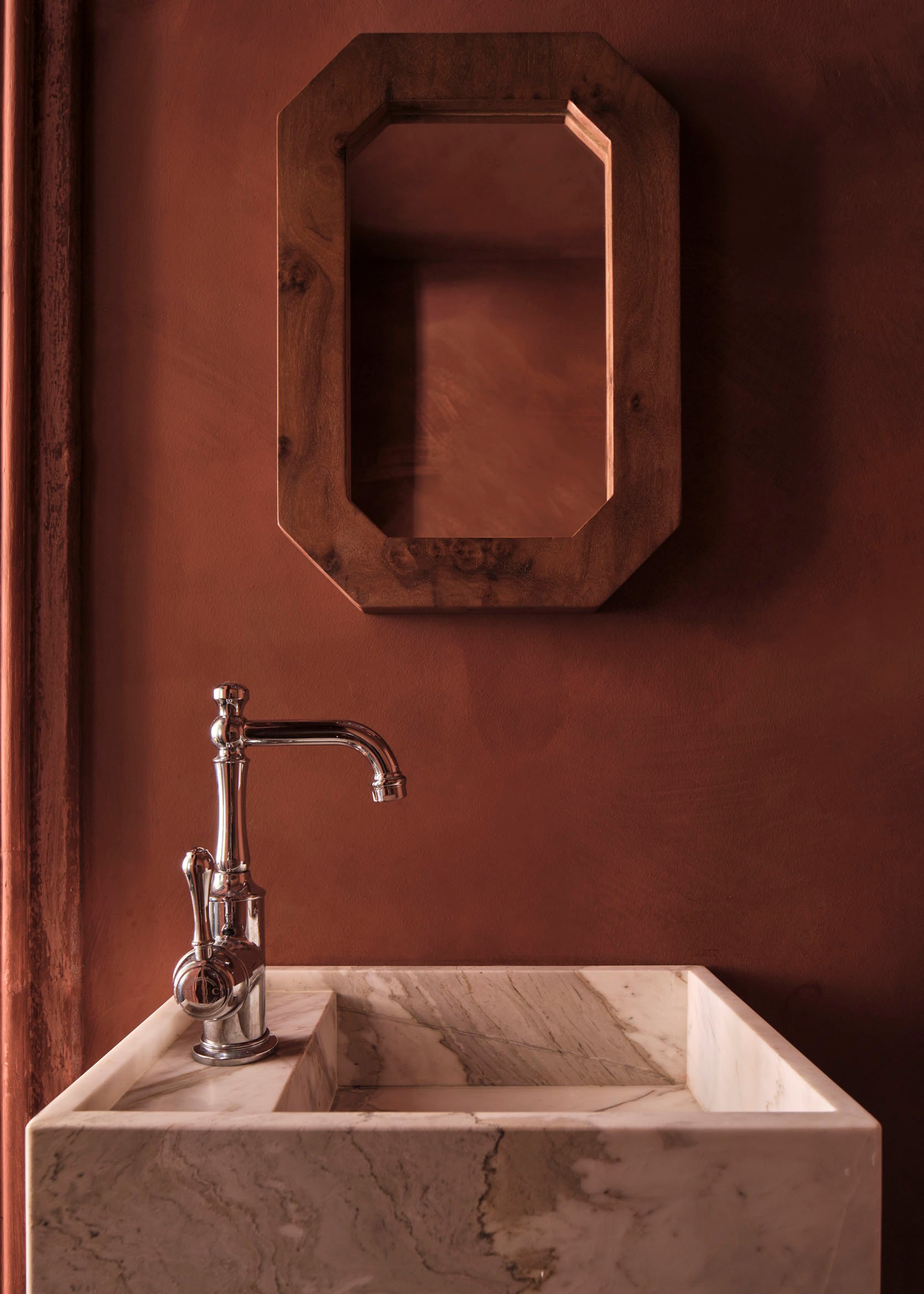
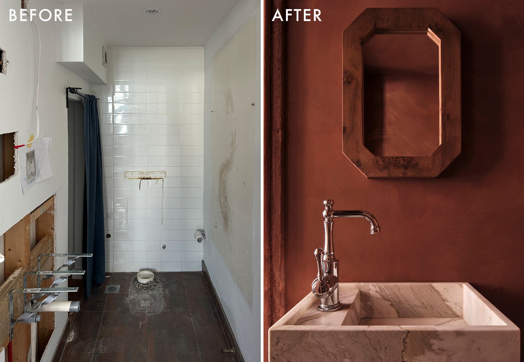
From the before photo, this bathroom got a huge glow-up. The only thing I wish was different was that we could see more of it! But that paint color is absolute perfection and I love that she went with a silver faucet against the warm walls. Oh, and that incredible cool mirror is custom from a company called fform which is also in Australia:)
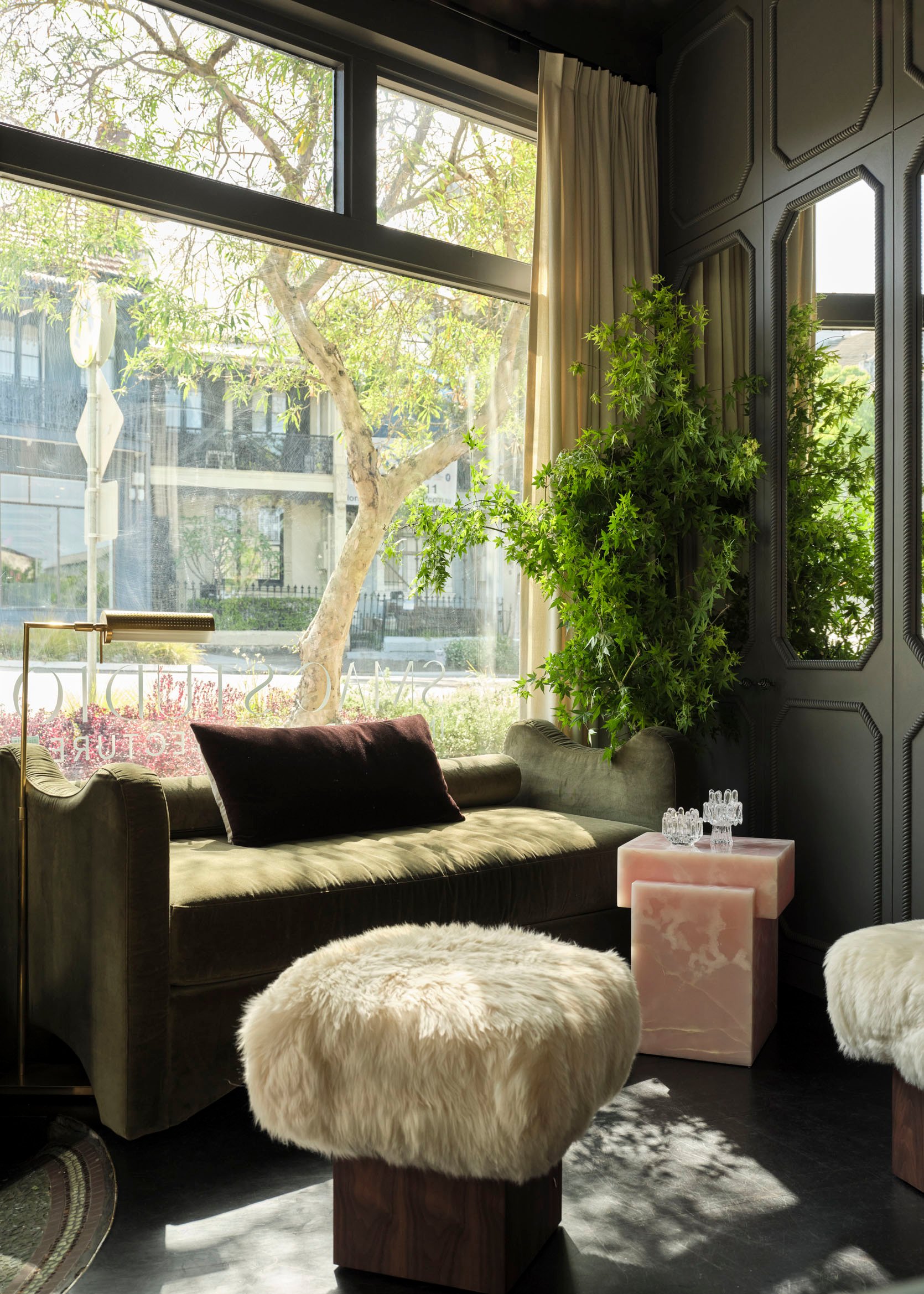
Now, moving downstairs they created a beautiful lounge/client area. The mix of materials makes my heart sing. All of these pieces above are also from fform and I want each and every one of them.
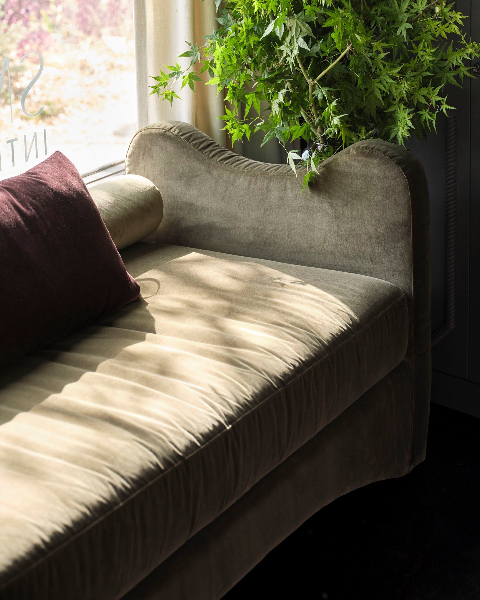
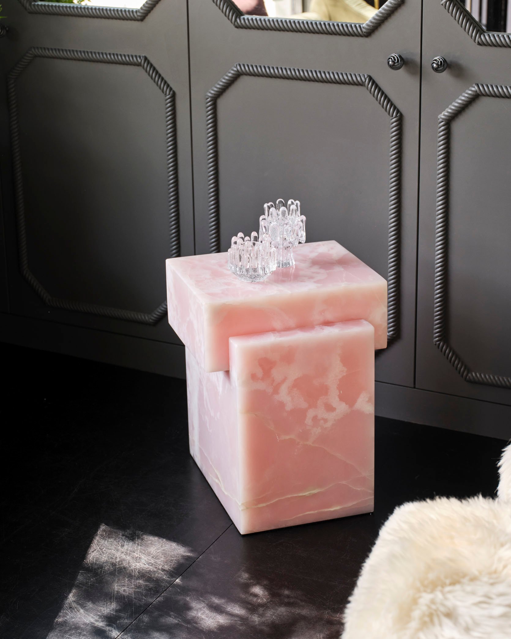
So the curves of the green bench are beautiful and that pop of pink stone is the perfect color and material contrast.

Here’s that opening photo in its full form. I really love the juxtaposition of all the styles coming together to create such a layered, unique, and yet welcoming space. The richness of the burgundy rug (also one of Shona’s designs) along with thrifted chairs (dream score!), and dark walls beautifully contrast the light-toned sofa, painting, and other decor accents. It just feels exciting but not visually overwhelming if that makes sense.
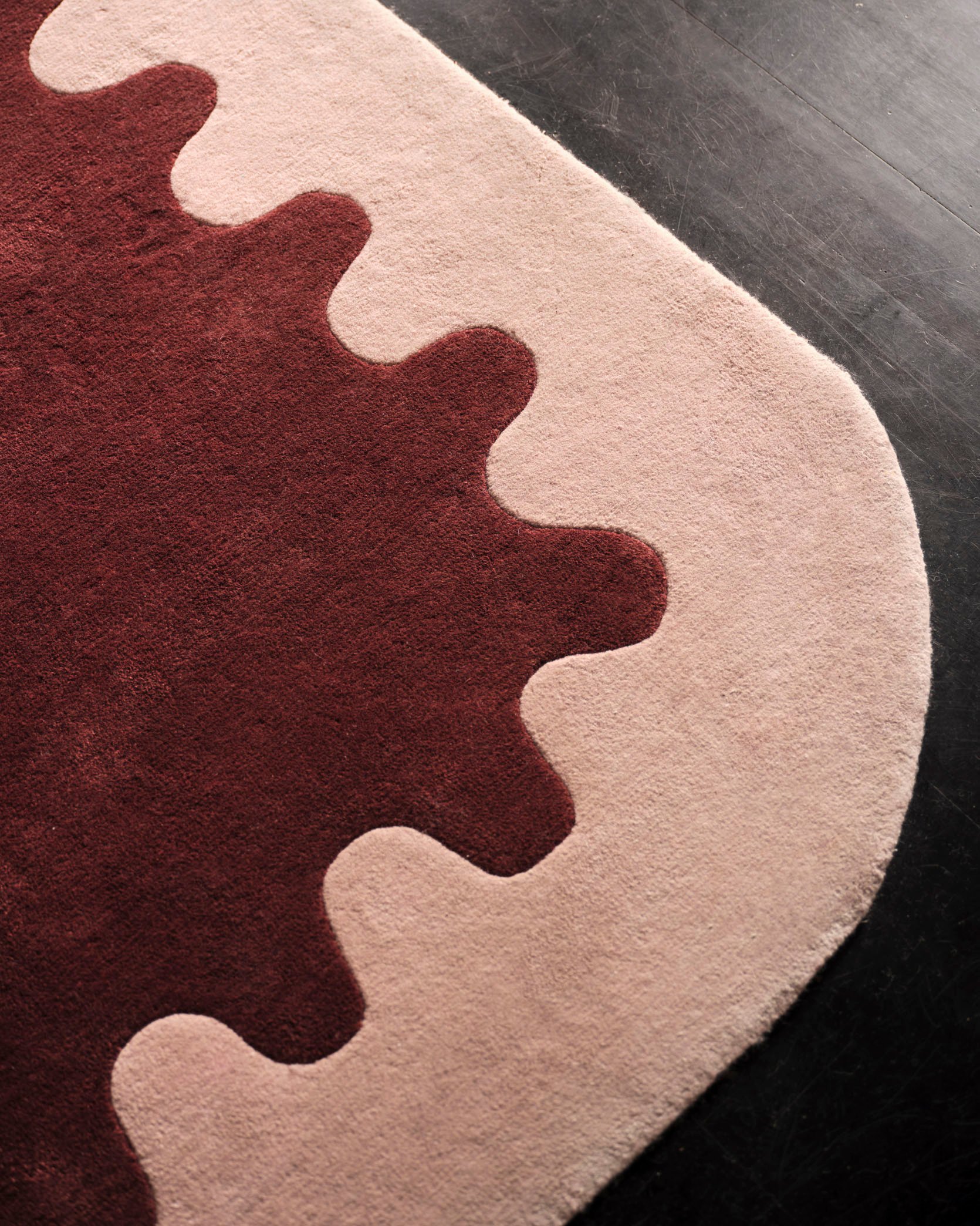
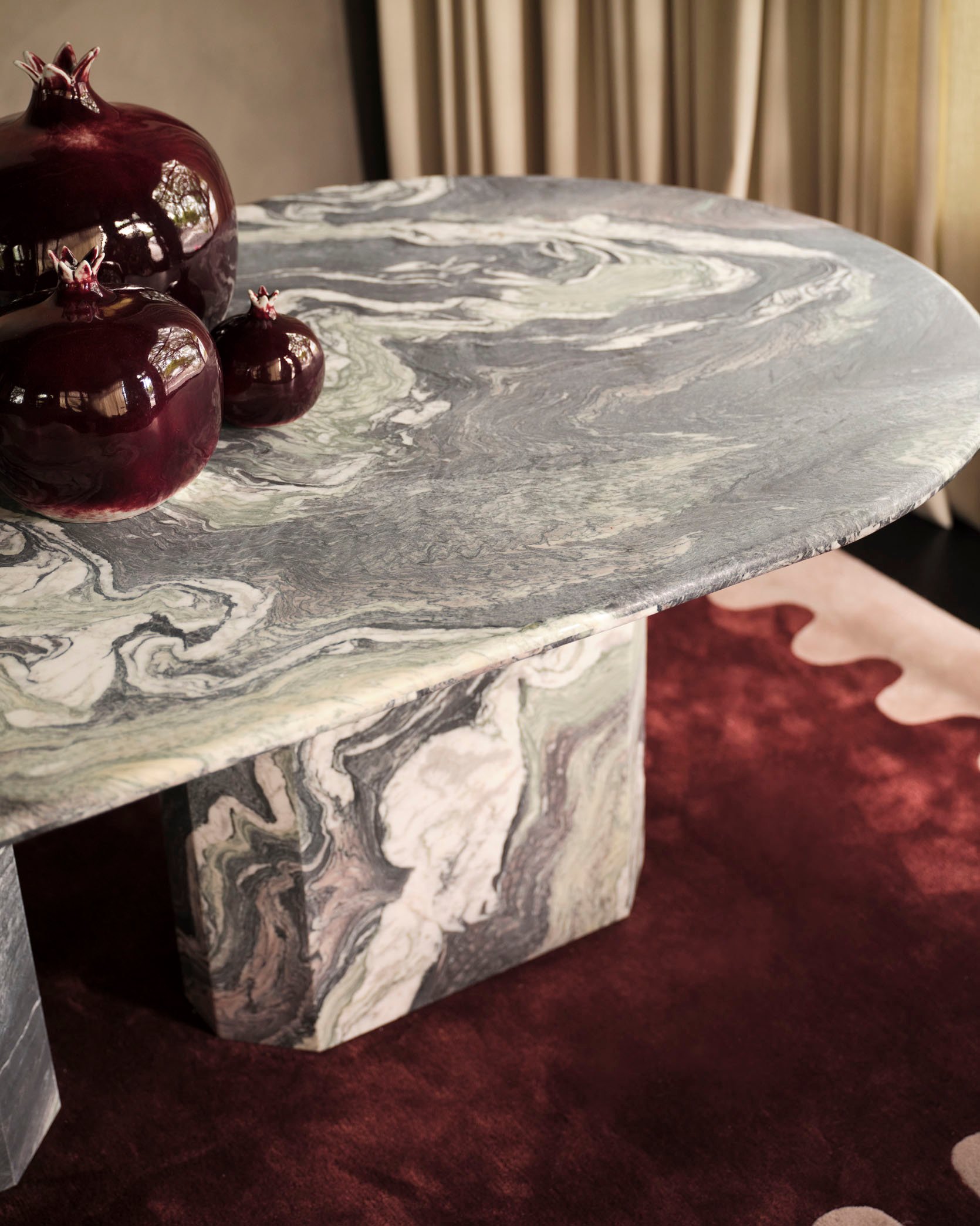
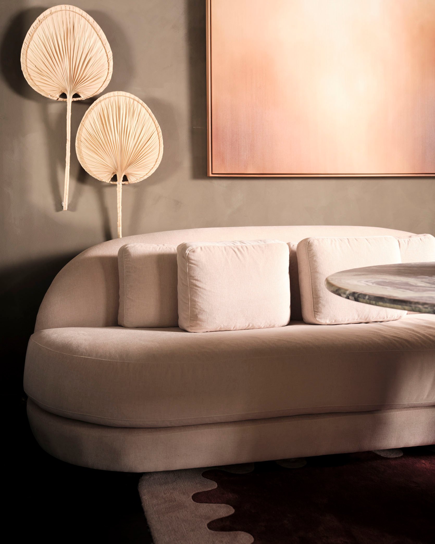
And I love this kind of rounded motif she chose for the larger pieces. Both the take and sofa are from fform and a fun fact about the rug is that colours were inspired by Shona’s favorite dress, “an Oscar de la Renta gown I picked up at a charity sale.”
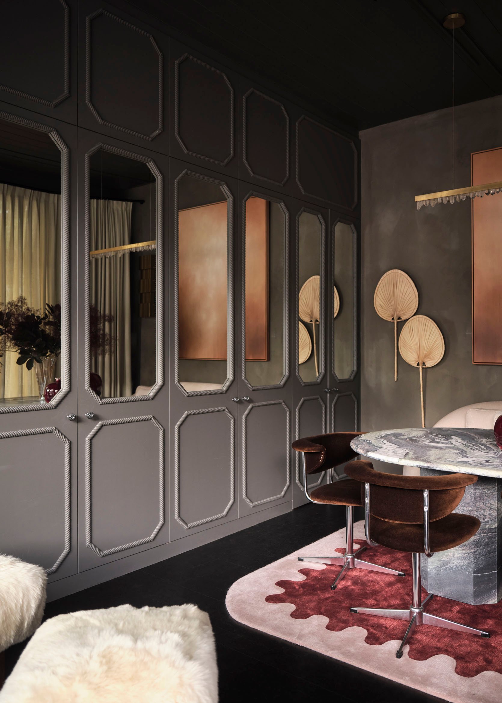
Finally, we have to talk about this cabinetry – the real small space hack of the whole space. Here’s what Shona had to say about it, “I think the cabinetry is really successful. It hides all our samples, our aircon, our kitchenette and our bathroom. Even though we used 600mm to put it in, it makes the space feel bigger. The rope profiling is modern and classic at the same time, and a little bit fun.”
I couldn’t agree more that it’s a success. The mirrors bounce the light around the space, making it feel larger, the style feels like it’s paying homage to the style of the building and creating (yet again) a beautiful contrast to the modern decor pieces. Oh, and that I’m sure having all that storage is a incredible:)
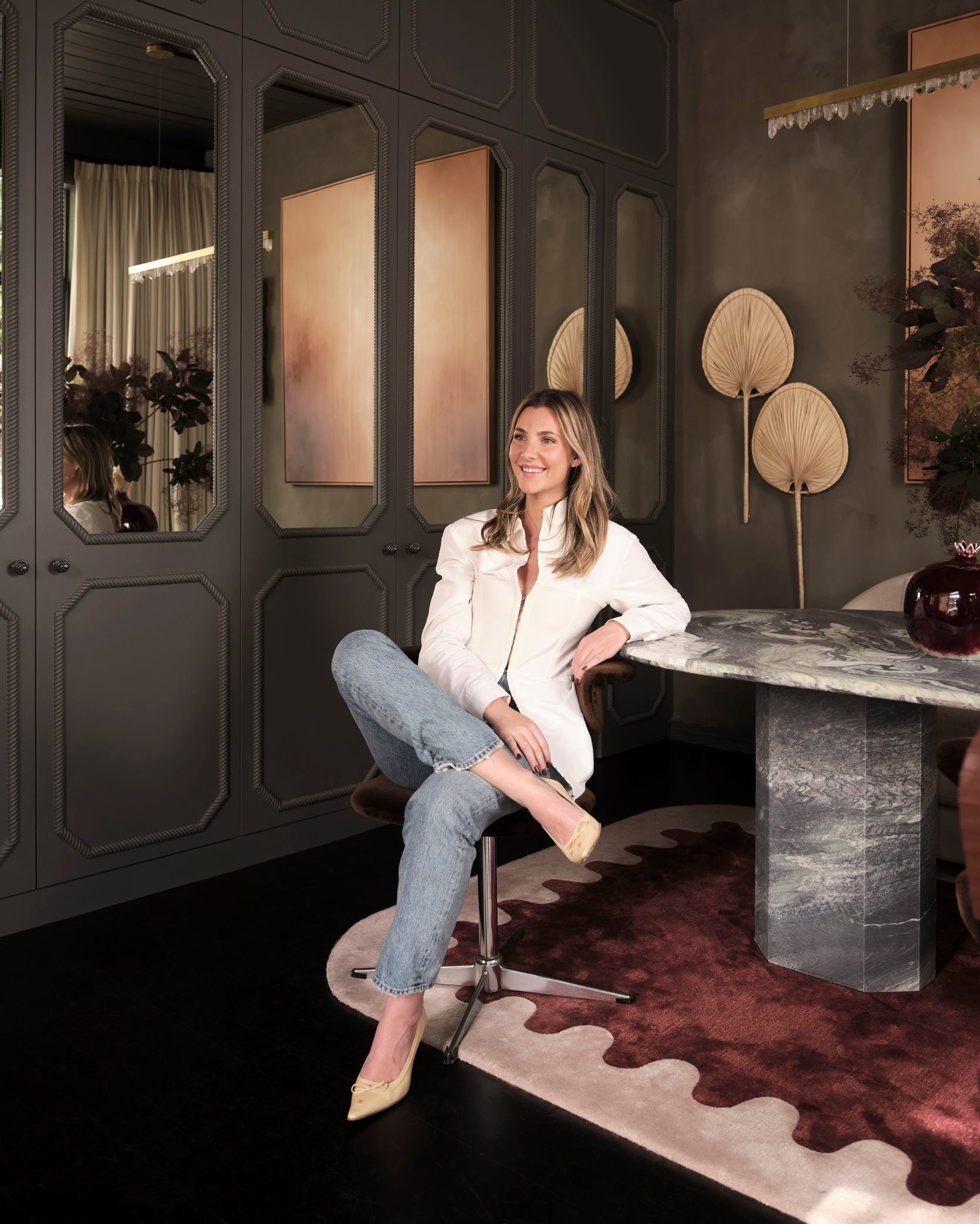
That’s it for today’s beautiful design offering. Thank you to Shona and her team for sending this tour through and hope you all loved it as much as we did.
Oh, but before I go let’s just once again see the before and afters side by side for a final design dopamine hit.

Ya, I feel pretty inspired too:)
Love you, mean it.
*Design and Styling by Smac Studio
**Photos by Dave Wheeler
