
Bringing warmth and joy into our home during the summertime is easy, thanks to the abundance of natural light, celebrations and brighter colours the season brings. With summer now behind us, Dulux colour forecasters predict that consumers will gravitate towards more serene, muted colours that evoke calm and a subtle sense of luxury, as they take time to reflect, unwind and enjoy simpler pleasures leading up to the cooler months.
“Warm neutrals, earthy yellows, soft greens and cool blues such as those featured within the Dulux Still palette, one of the three palettes from the Dulux Colour Forecast for 2025, encapsulates this feeling Australians may find themselves yearning for this autumn and winter,” says Andrea Lucena-Orr, Dulux colour and communications manager.
Stylist Bree Banfield, together with the Dulux team, have worked their creative magic on this living room and bedroom, offering inspiration for how we can use the Dulux Still palette in our own homes this autumn/winter.
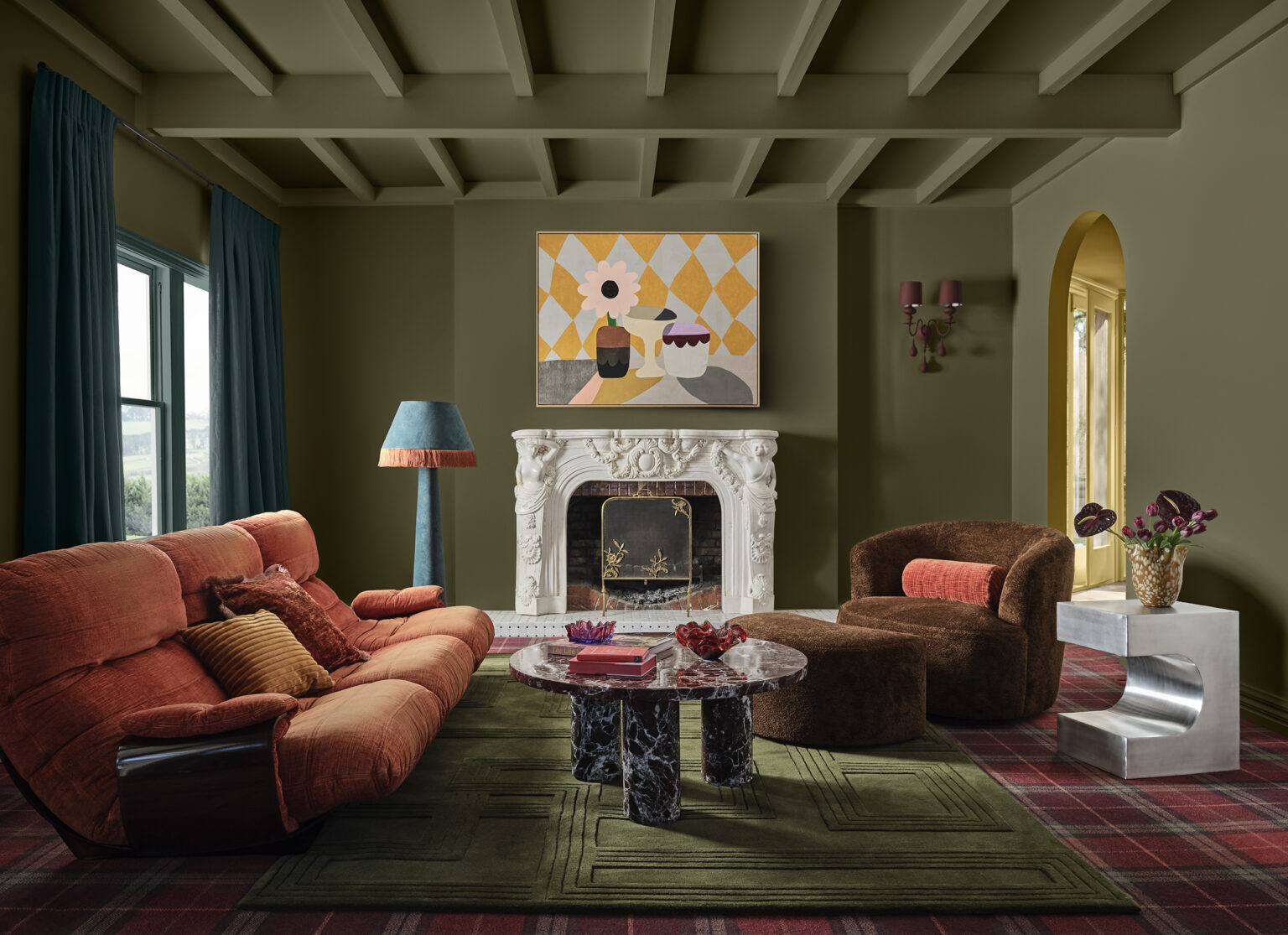
“As an extension of an Edwardian home, the modern living room and bedroom spaces featured predominantly white walls. We had an opportunity to add warmth through colour and beautiful textural elements across furniture and décor to transform the space,” Dulux colour manager Lauren Treloar adds.
Looking to re-introduce the warmth that was missing, the team took inspiration from nature using colours and textures from the Dulux Still palette to create a balanced harmony between minimalism and subtle luxury.
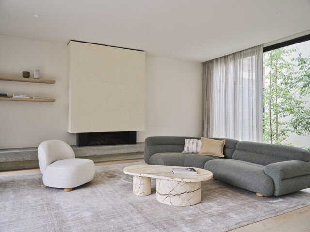
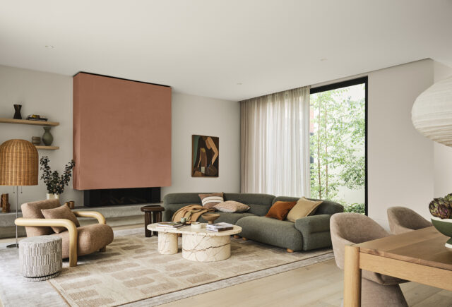
The rich, reddy brown of Dulux Clay Court acts as a statement above the fireplace within the living room, contrasted against Dulux Mellow Beige on the surrounding walls. The accent shade completely elevates the feeling within the space, whilst also creating a sense of calm that invites you in to rest and reset.
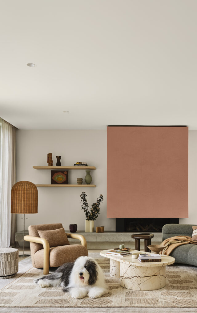
Offset against Dulux Antique White U.S.A. which appears on the ceiling, the team then went in to layer different textures and decorative objects, referencing some of the softer colours from the palette including muted creams, greys and browns.
“The living room features a healthy amount of enticing texture and colour, such as the boucle armchair, the woven throws and cushions and woollen carpet offering a plush feeling underfoot. As natural materials are key to this trend, we referenced eco-friendly finishes like timber in lighting and furniture pieces. Elsewhere, organic shapes and detailing can be seen in the rounded marble coffee table and other handmade decorative vessels. The end result is a look that’s elegant and sophisticated, yet approachable,” Bree says.
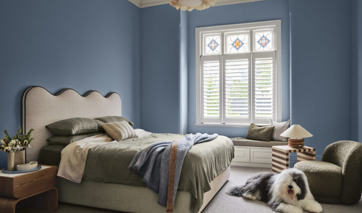
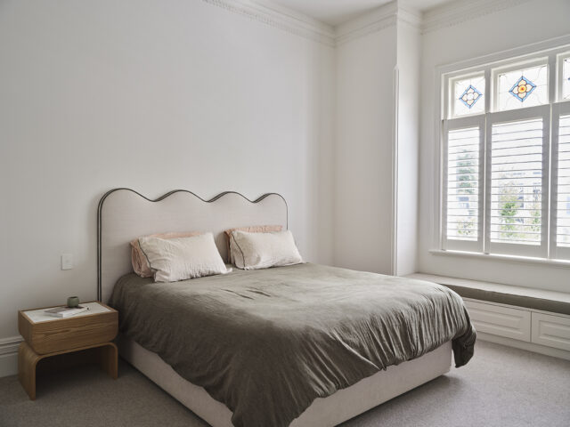
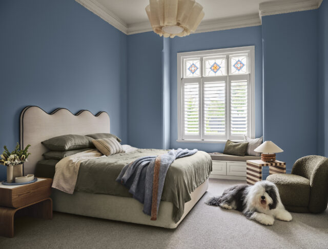
Knowing that bedrooms are a great space to introduce bolder colours, the team turned to the deeper shades from the Still palette, landing on Dulux Enterprise – a darker moody blue with grey undertones.
“With high ceilings and traditional leadlight glass, the room had a lovely airy feeling but lacked a sense of grounding,” Lauren adds, “incorporating the cool blue within the space has helped bring a relaxing and peaceful atmosphere without dominating the space.”
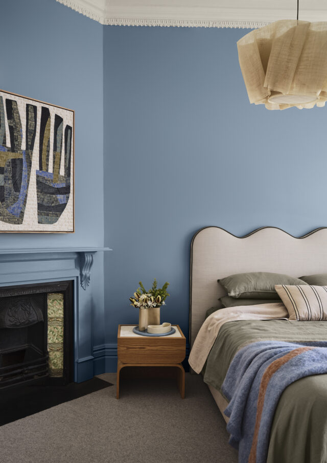
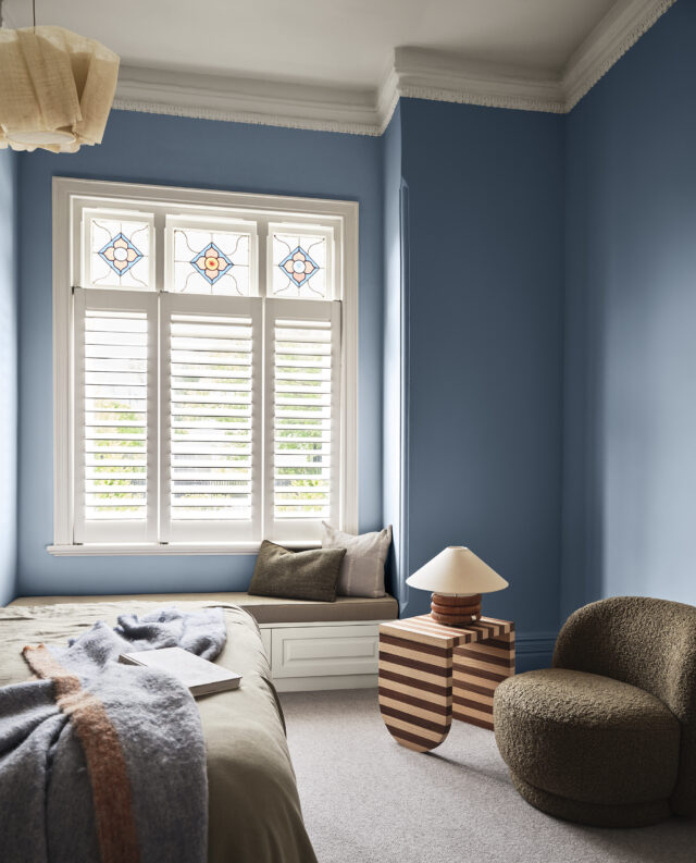
Andrea adds that cool blues and green tones, like those featured in the bedroom, encourage a sense of mindfulness and connection to nature. “The Still trend embodies this sense of quiet luxury, so to complete the look we made sure to incorporate soft and organic forms within the bedding and furniture pieces, layering different textures such as wool and linen.”
“Summer can be a busy time and as consumers continue to face cost of living pressures, the Dulux Still trend offers an antidote to the current mood. It’s a palette that feels comforting, harmonious and reflects the seasonal shift towards a slower, more reflective pace of life as people retreat indoors.”
Lauren adds that the Dulux Still palette will resonate strongly with consumers as the neutral palette offers a perfect stepping stone for those wanting to introduce more colour into the home.
“Dulux Clay Pipe is a brown-based warm neutral ideal for walls and ceilings. It’s fast-becoming popular with consumers and works well with Dulux Antique White U.S.A. to add a sense of inviting warmth to a space.
“Each of the colours within the palette have a greyed-off, soft and muted undertone giving them a timeless, grounded quality. For those wanting to enhance the feeling of sophistication within your home, look to incorporate richer shades from the palette, such as Dulux Clay Court, Dulux Studio Cream or Dulux Pesto.”
For more on the Dulux Still palette.
Styling: Bree Banfield | Photogrophy: Lisa Cohen
Where to spend money on renovations before selling a home
When it comes to selling your home, making strategic decisions on where to spend your renovation budget …
