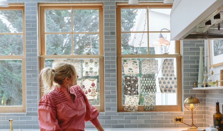
This is a real Deja Vu post for a lot of you. YES, last year at this time I did a post about how I want cafe curtains in my kitchen and then did nothing about it. You see I really only want/need them during the winter when it’s so dark outside and at the time I didn’t have the time to think/shop for the right patterned fabric. But the longer we live here the more I really really want to have these curtains AND add pleated fabric patterned shades on all our sconces (stay tuned on that one). And I finally realized the type of fabric I wanted was a small print on a relatively thin fabric and I couldn’t find this in store at all.
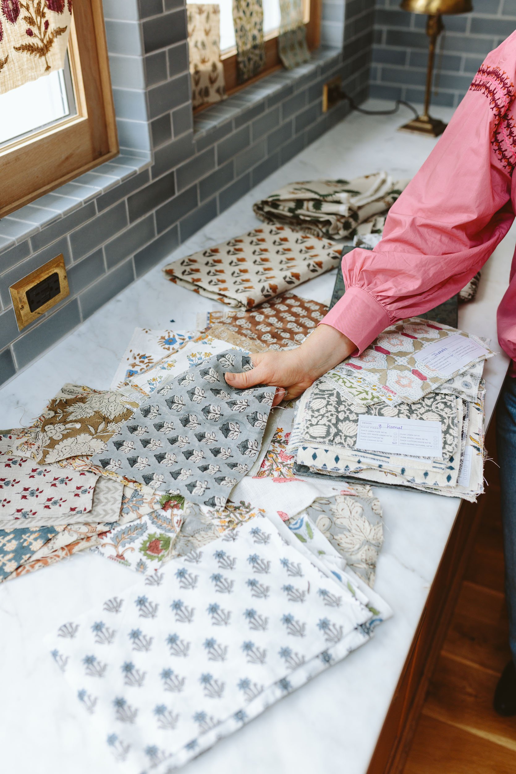
So I started shopping for block print fabrics, mostly from India since that’s where the artisans typically specialize in this. They all sell via Etsy so I started ordering sample after sample.
But the problem with these is that there are thousands to choose from AND you can select what type of fabric you want – i.e. cotton, pure white linen, off-white linen, thick linen, Duck fabric, etc. And each color of “stamp’ on the fabric looks different depending on the base fabric. So therefore this has taken forever (months) to order all the options I want.
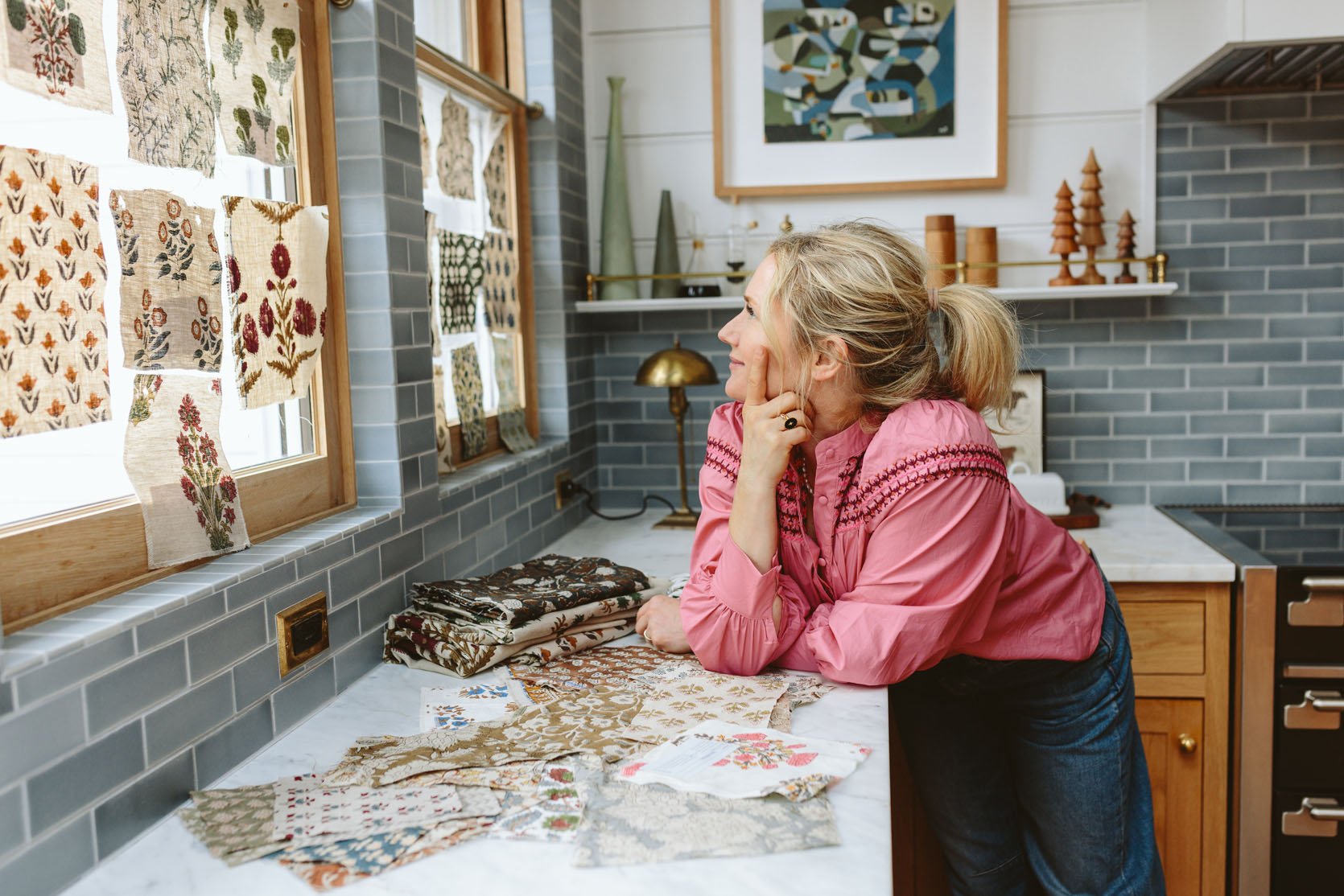
A lot of the samples had to be made and many only came in as small as a yard. So many of them I love up close, but then as you stand back in the back of the living room they don’t read as well (either too dark or too polka dotty). I also don’t want them to be too thick as they need to give off that airy casual vibe (not a forma creased pleating – I’m not opposed to pleating, but I don’t want thick fabric and pleating look for this space).
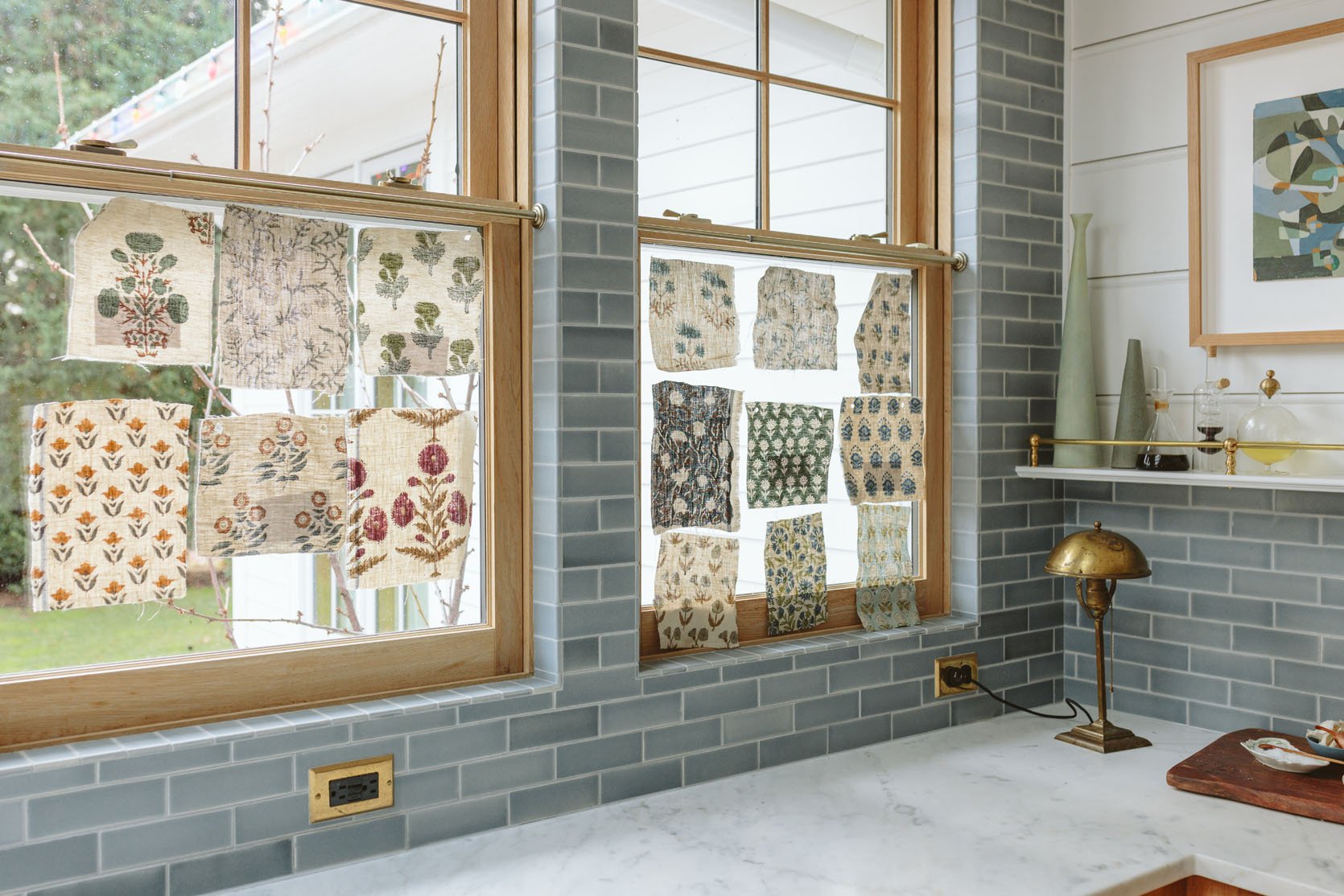
I wanted to bring in some warmer tones since the island has a lot of red/purple in it and it’s definitely my “accent” color. But I also don’t want it to be too jarring as when you look at the space as a whole (kitchen, living, nook, entry) a more cohesive color palette will, I think, be more calming and harmonize better.
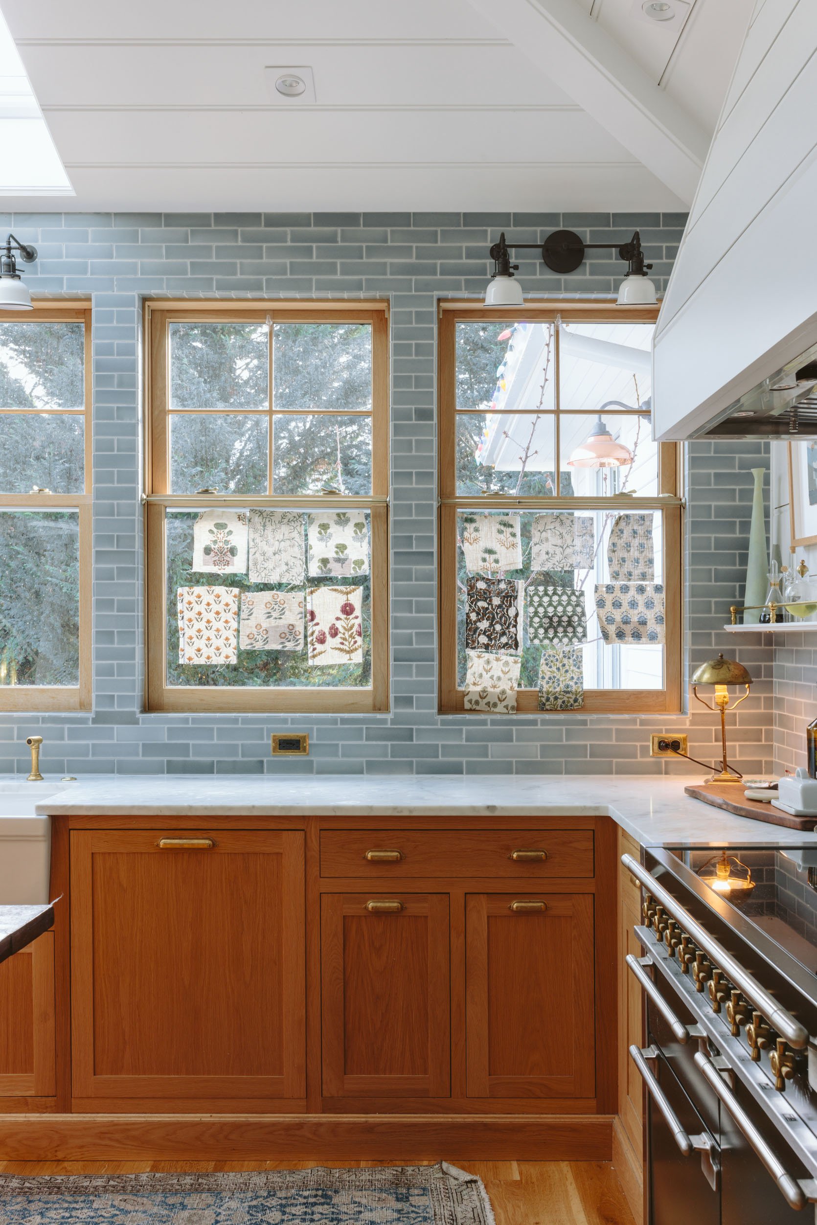
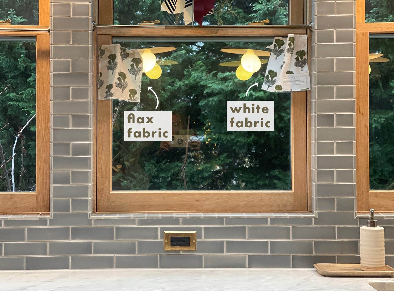
I also can NOT decide between a more white background or the flaxier fabric. The white is fresh and the color pops off of it nicely, but the flax looks good with the wood and is certainly more warm.
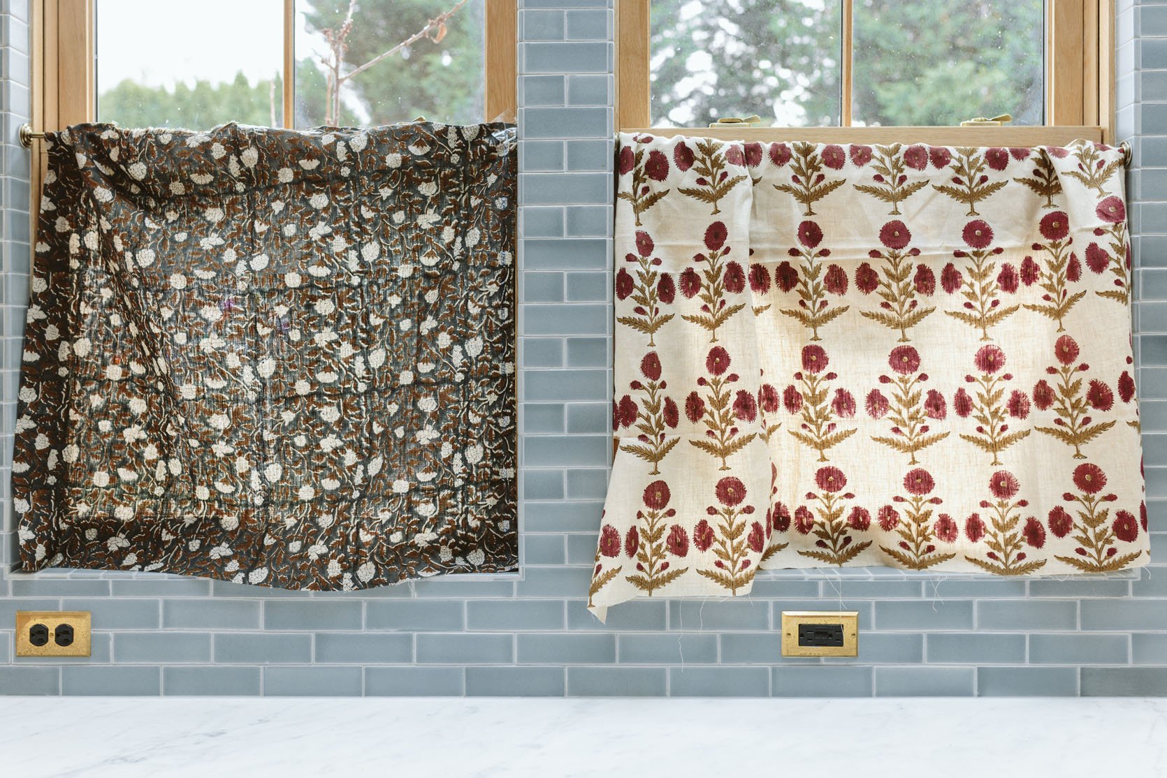
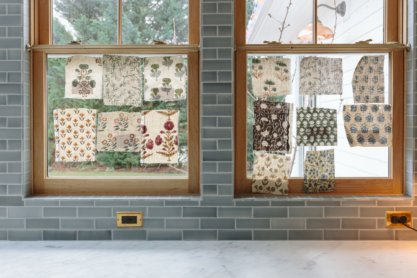
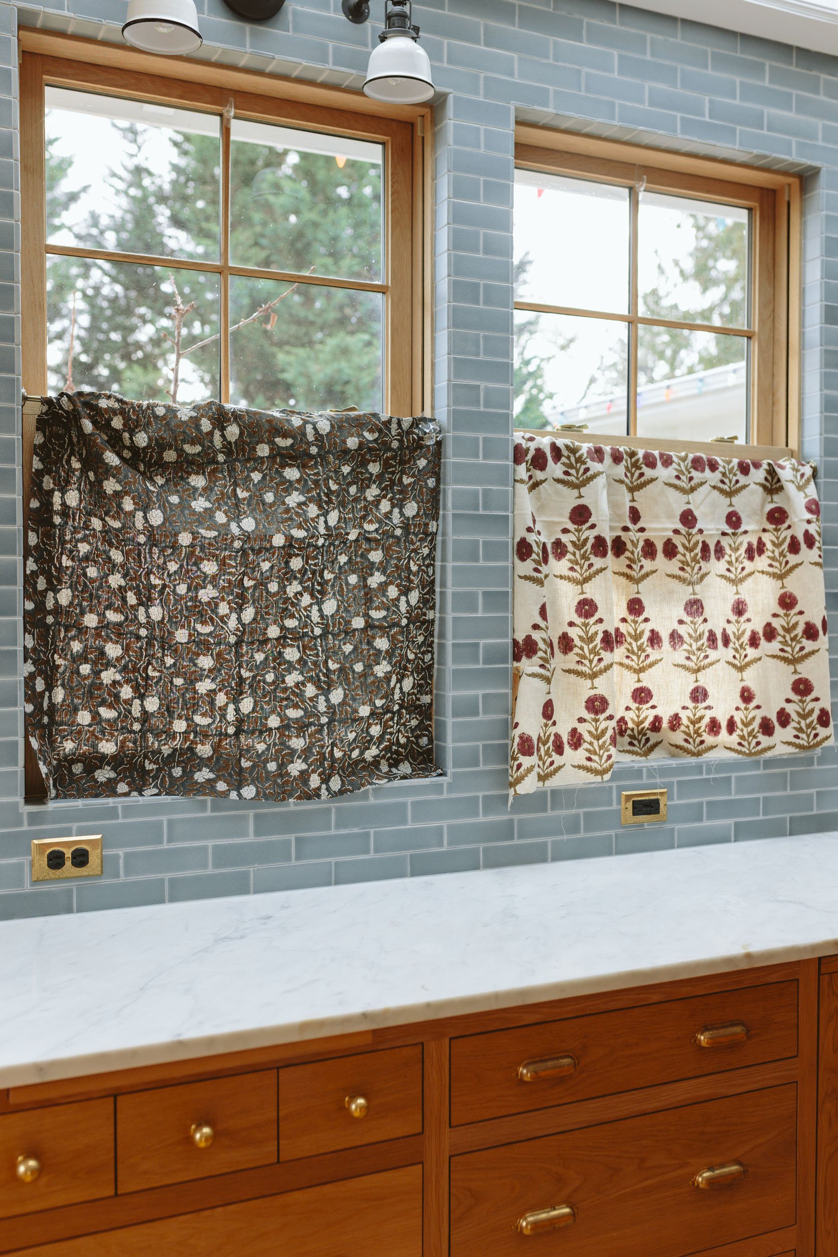
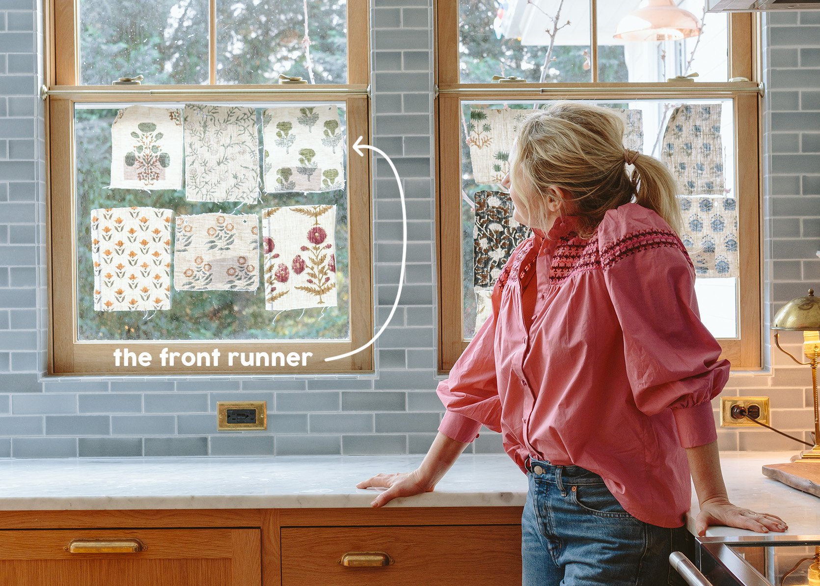
At one point (the day we were shooting this) we narrowed it down to these two fabrics, but when we hung them up neither felt right. From a distance, the one on the left was so dark (when you are in the kitchen it’s so cozy) and while I love that burgundy floral one it actually looks a little stripey with the repeat from a distance and I think I want something that is more fluid to offset the rectangles of the windows and the tile.
So where I’ve landed right now is we all (including Brian and the kids) love this blue-green floral pattern, where the flowers are staggered (not in a line). But I can NOT decide between a brighter white fabric (looks so good with the walls and pops against the windows in a happy way) or the natural linen (warm and more casual, but will it look just dingy?).
Sadly, I don’t have a professional shot to show you – I ordered the bright white sample after we shot this, but here is an iPhone shot of it. I fear that I’m drawn to the white more because I like crisp colors, but is it too high contrast?
Anyway, I SWEAR I’m on it this time. I love so many of these and I’m unsure if I’m going to DIY this or hire out. And I’m happy to say I think one of these will also be our pleated lampshade fabric (which we are going to DIY here since they are going to cost $115 EACH to do – and I have 9 of them, so…)
A fun process post for you today:) The holidays are nuts and even I get sick of looking at holiday stuff all December, so I hope you love a quick design update post 🙂
*Photos by Kaitlin Green
