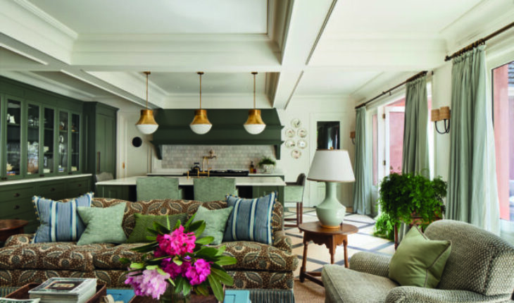
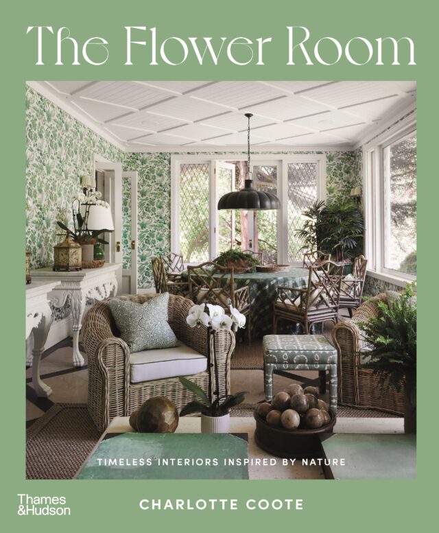
The following is an extract from The Flower Room by Charlotte Coote, published by Thames and Hudson Australia, RRP $59.99, published on 29 October 2024.
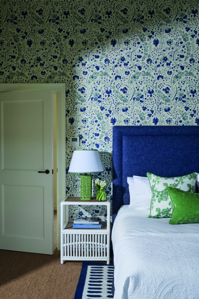

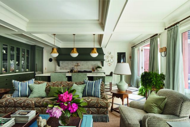
STEP 1: SELECT A FLORAL TEXTILE: Think outside the square. Rather than running to your favourite textile house, consider antique textiles. I love walking into a room and seeing a textile I don’t know. Antique textiles immediately add authenticity, interest and charm. They can also be a cost-effective and sustainable way to repurpose something that would otherwise have been discarded.
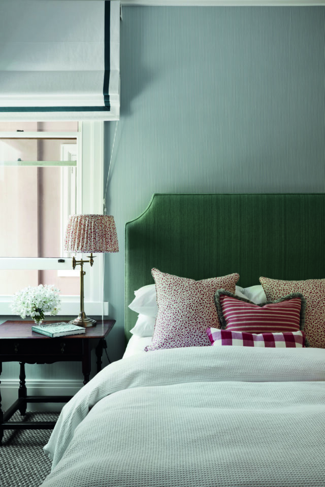

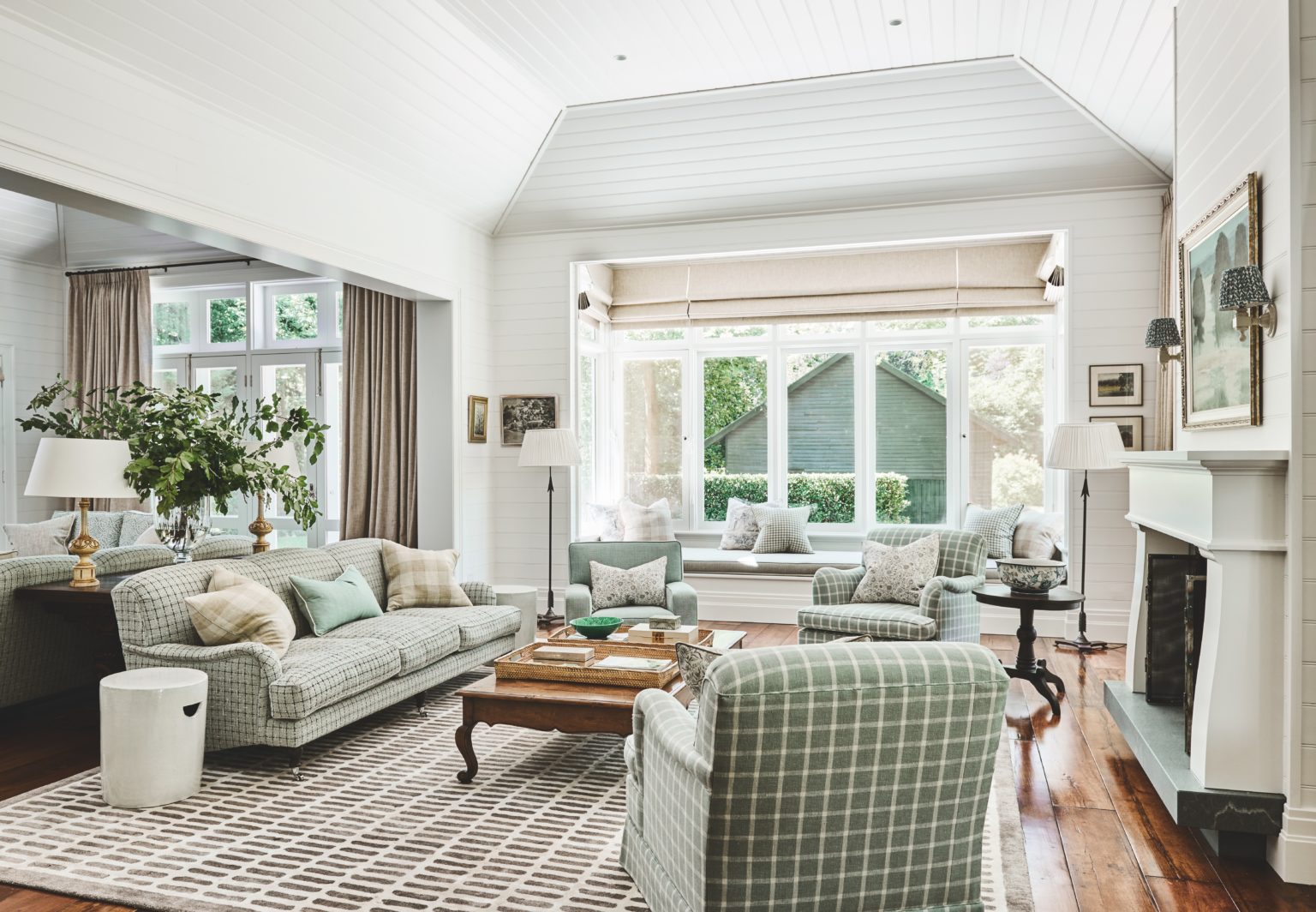
STEP 2: ADD STRUCTURE: Include lineal textiles like different scaled checks, stripes or plaids to balance, support and anchor large and smaller designs. Remember that opposites attract. Curved shapes sit well next to straight ones. Put chaos next to crisp, hard next to soft and masculine next to feminine. Robert Kime once said, ‘Put something modest next to something quite grand. They will help each other to be more interesting.’
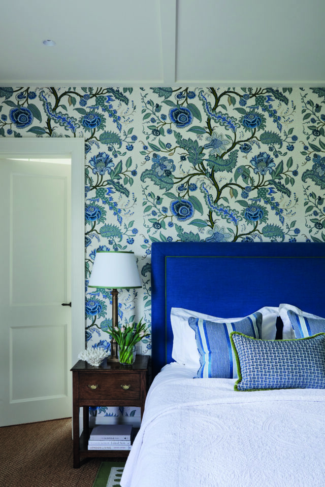

STEP 3: MODERNISE THE LOOK: Move away from the excess of the 1980s. Be inspired by the best parts of your memories of your grandmother’s home, rather than rolling it out in full. Reinvent botanical-inspired schemes and curate relevant contemporary themes that breathe life into an interior. Use modern materials like Perspex, glass or lacquer next to chintz or botanical textiles to modernise them. Put something old-fashioned next to something edgy or unusual. Modernise and layer the look even more using contemporary pieces of furniture, lighting and artwork.
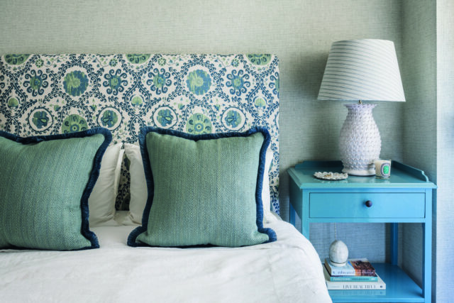

STEP 4: CONSIDER SCALE AND TEXTURE: Include a diverse range and scale of textiles – a small ocelot print works well next to a medium-scale check. Consider juxtaposing hard and contrasting textures with soft textiles. You might place a velvet sofa with linen scatter cushions next to a travertine coffee table.Mixing large-scale textiles with small-scale textiles works. However, combining medium-scale textiles with small-scale textiles usually doesn’t. Sometimes two medium-scale patterns can work if the colours are reversed. For example, one medium-scale textile that is predominantly dark blue with a hint of white could work with another that is predominantly white with a small amount of dark green. It’s always a good idea to include a plain coloured or textured textile in the mix to help neutralise things.Trust your instinct. Understand and learn the building blocks you can use to create a scheme, then establish rules of your own.
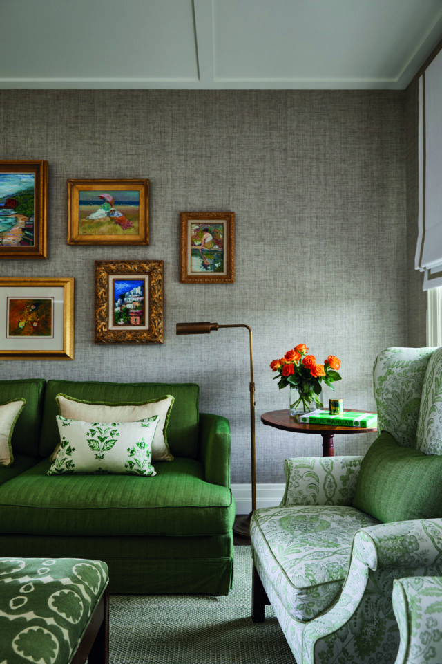

STEP 5: CONSIDER COLOUR AND QUANTITIES: Note the colours of your main hero botanical print. They will inspire the colour palette for your entire textile scheme. This doesn’t mean you need to match those colours identically. For example, slightly clashing colours can be very interesting to the eye.If you lose your nerve and only want a pop of a textile or colour, use it on a scatter cushion or occasional chair, rather than an entire sofa. Similarly, if you are mad about a textile but can’t afford lots of it, use it on a cushion rather than an entire sofa.Think carefully about where you plan to use each textile and how much of it you want to see in the room. Looking at 20-centimetre-square samples of a textile is not the same as looking at it en masse.

For more on Charlotte, of Coote & Co | For more on the book


The furniture layout rules you need to know
The following is an excerpt from Colour Is Home, the new book by Australia-based international interior designer …

