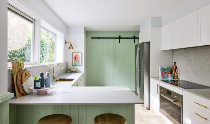
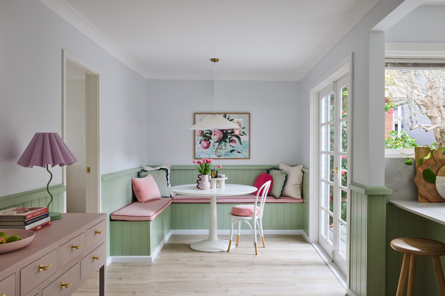
Green, in all its lush, vibrant, calming, renewing iterations, is the colour we are loving for interiors, from lime to emerald, sage to pistachio. It’s appearing as a wall colour in bedrooms and living areas, in tiles for bathrooms, cabinetry for kitchens and in soft furnishings for nurseries. Credited with bringing a sense of calm and wellbeing to a space, green is a colour that works with so many others. We only need to look outside, at the natural world, to gain inspiration and confidence in our colour choices.
Colour by Wattyl, a collection of more than 1500 colours, features a spectrum of greens from the palest celadon to the deepest forest, and everything in between. The brand’s colour expert, Katherine Champion, has created a few contemporary colour combinations to inspire and assure the consumer that green is a must-have, versatile hue, suitable for all rooms in the home.
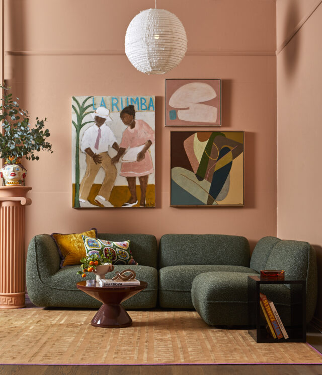
Down to earth
The combination of warm, earthy hues and forest greens brings a sense of calm, comfort and authenticity to a space. These colours can be beautifully layered with ochres, browns and peachy shades.
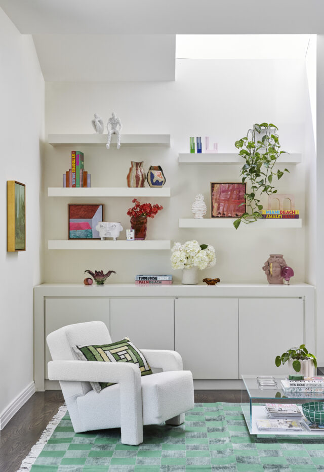
Fresh
All greens create a beautiful contrast with white, but this combination in particular breathes a sense of Springtime freshness into a room. As a general rule, cooler greens, and those with yellow undertones, work best with crisp, fresh whites, while duskier, more muted greens can work well with both cool and warm whites.

Colour pops
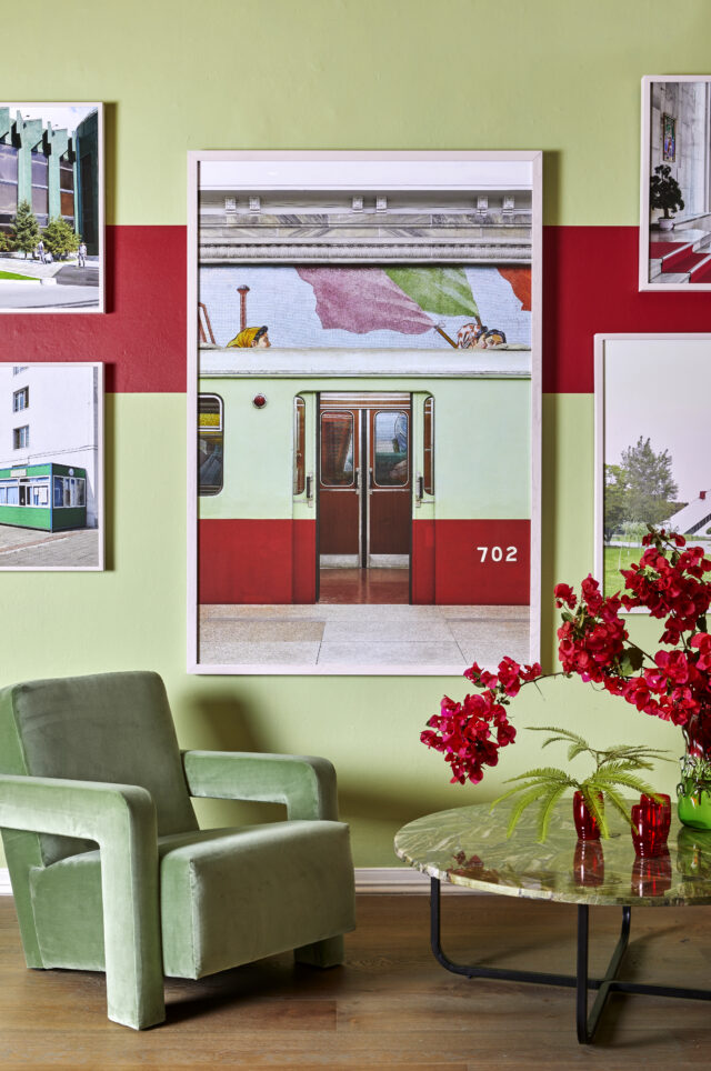
Red and green, it’s a joyful, almost festive combo (think Christmas!) – they appear opposite each other on the colour wheel and are also referred to as complementary colours. Here, Wattyl shows how these colours can create vibrancy and positivity within a space.

Green on green
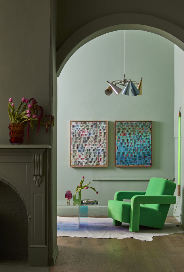
One of the easiest colours to layer, green can be used as a neutral as well as an accent hue within the same space. For inspiration, and confidence in colour layering, simply turn to nature – the surrounding landscape will provide endless ideas to replicate indoors.

Zesty
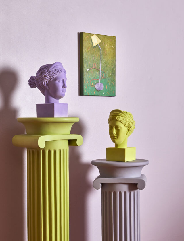
The green palette also encompasses the zesty limes and chartreuse hues that work so well with lilac and purple colours. Here Wattyl has chosen some yellow-based greens, alongside a soft lilac, to create a mood that is both playful and fresh.

Green is possibly one of the most versatile colours on the colour wheel and pairs well with both neutrals, such as browns and greys, as well as warmer hues such as yellow and red. Wattyl encourage consumers to experiment with colour combinations by purchasing sample pots and testing the colours within the space to be painted (wall colours will be influenced by light and surrounding fixtures and furnishings).
Swatches and sample pots, together with cans of paint, can be ordered online.
Images courtesy of Fenton & Fenton

