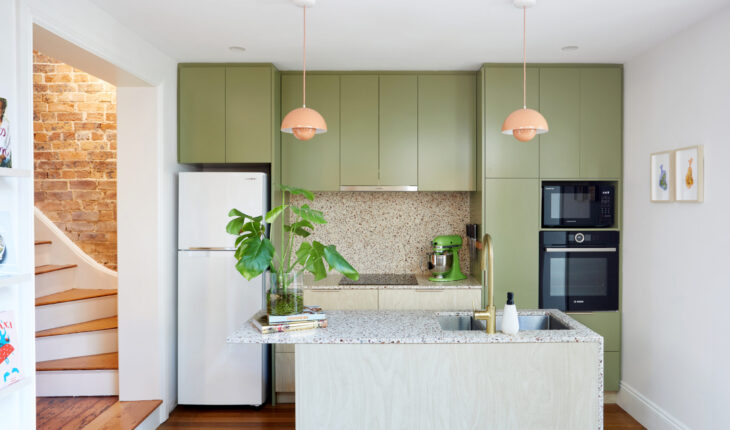
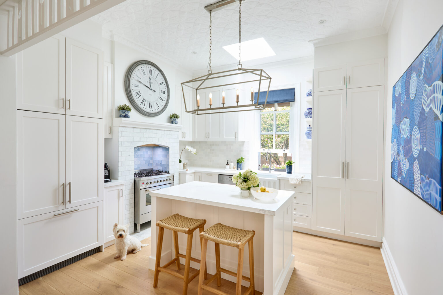
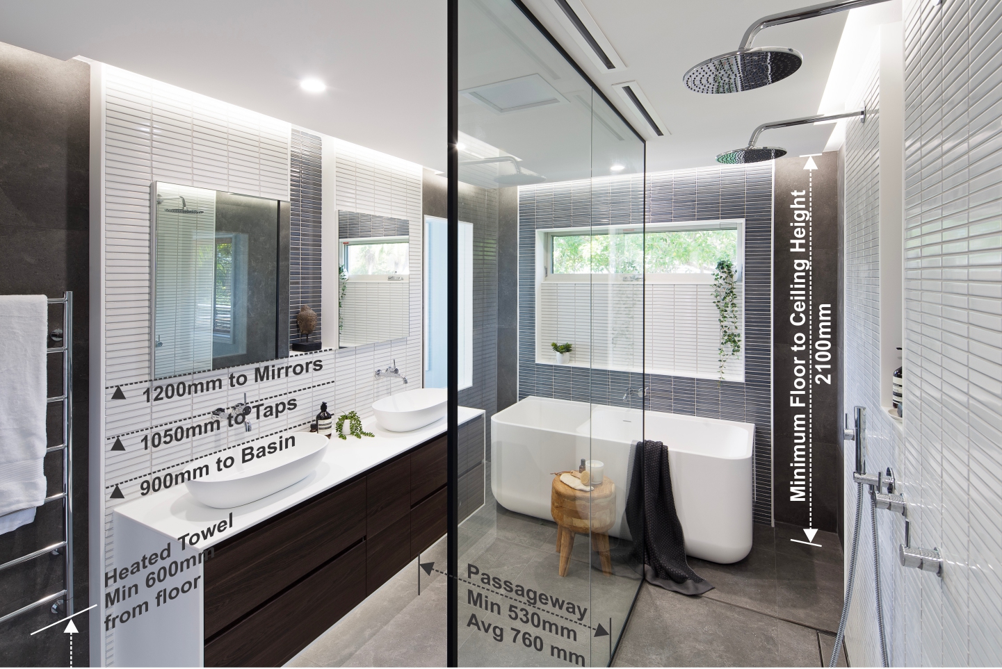
Over the years, I’ve had the pleasure of helping my clients design their dream homes with pattern and colour in different applications to create spaces that are full of personality and not mundane.
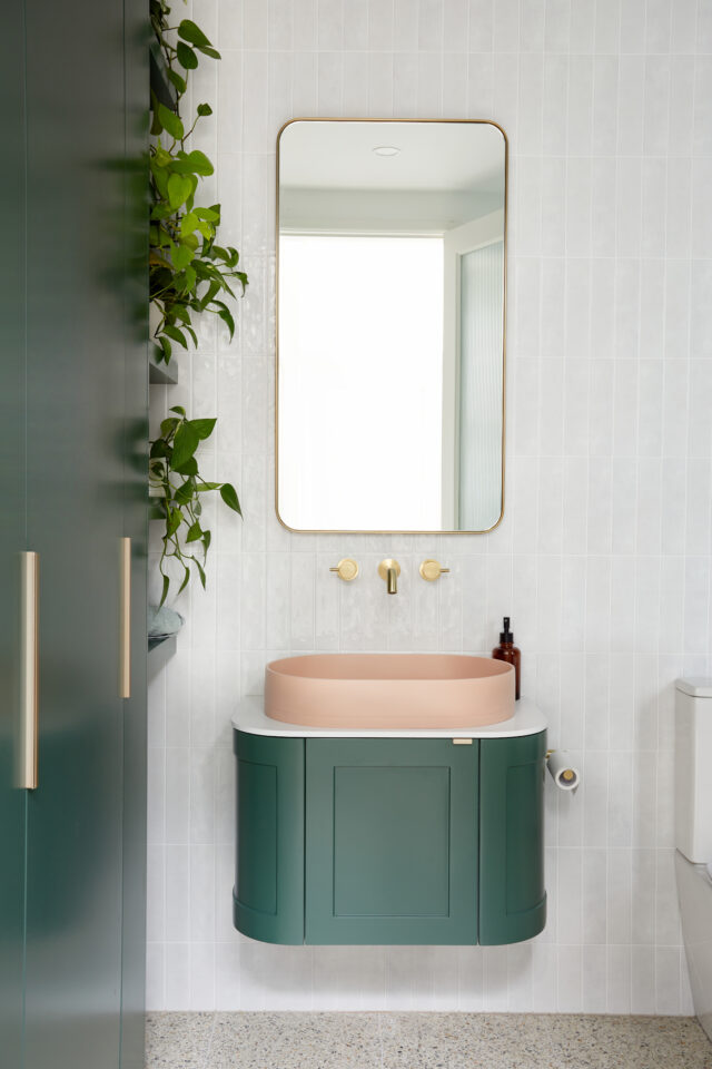
It is not an easy thing to do and often can be daunting as it is normally considered “risky” but as we can see with the moving of interior trends in 2025, colour drenching is in! I hope it is here to stay because in my experience, a trend like this one allows for more confidence in clients to explore colour as they are seeing it everywhere.
For the most part, we often see colour used in the form of soft furnishings and decorative pieces only as there is this conception it seems easier as you can always change it up, however I am here to guide you in getting confident in your choices so you can craft spaces that are unique to you from your bathroom to your kitchen.
1. Have a set styles as reference
Having a style or era that you want to reference, even if it is a combination of two is a great way to get inspired about how pattern and colour was used during that time. It can help inform an overall direction for the spaces you’re working with.

2. Work in threes or fours
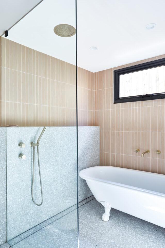
In bathrooms particularly, I often work in threes with choosing pattern. This allows for direction in terms of where pattern and colour will be going as you have multiple walls to work with. For example, the floor will be one statement, then there will be a complementing or competing tile choice or pattern as a feature and the third will be a neutral to diffuse the selection. This is particularly helpful when combining materials like terrazzo or natural stone with a pattern tile. Your vanity and basin are included in this too and are a great opportunity to introduce another textural layer or colour.


3. Undertones of colours are important to work with
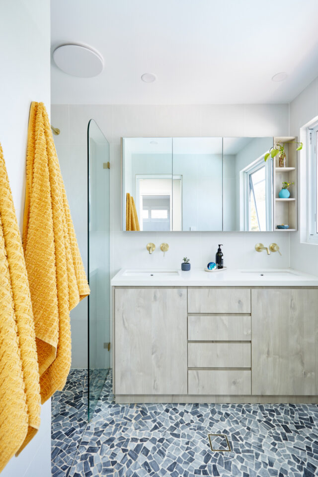
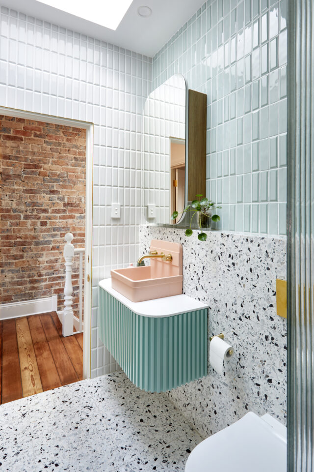
It is important that the tones of the colours in the space either completely contrast or they complement. This means there is consistency in how you approach the use of colour. To get even deeper, even if a colour contrasts, you can be clever to make sure the undertone of the contrasting colour is still complementary in its tone. An example of this is the use of the bold pink and green in our Newtown bathroom; both contrasting however both pastels and one is softer than the other.

4. Scale and sizing of materials
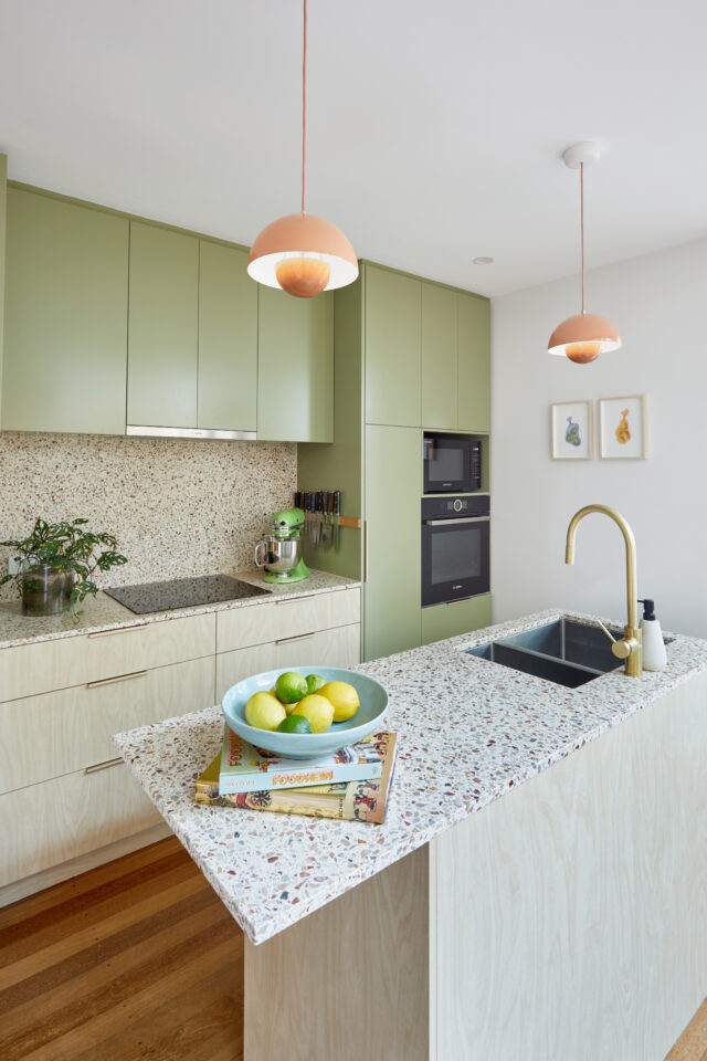
Mixing scales can assist in create a visually interesting and impactful space when using combinations of pattern and colour. An example of this is having a large bold surface like kitchen benchtops and then having a significantly smaller size material selection for the splashback or island feature waterfalls or breakfast bar. In this instance, I always aim to have one main feature large finish and then pair it down with smaller scaled materials or contrasting material like a Polytec or using texture like Steccawood profile.
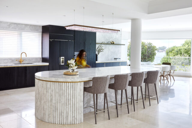

5. Layering materials
Layering materials such as tiles or stone and then pairing them with a timber or another material will work together to create a layered effect in a space. This again makes it visually interesting but creates a combination of textures which makes spaces or rooms feel curated.
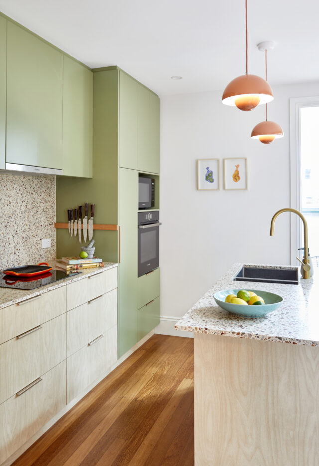

6. Set out and grout
Don’t underestimate the set out pattern of a tile. This means what may seem like a boring normal tile gets laid in a specific way and creates visual interest and impact. Same goes for grout. The combination of colour doesn’t always need to be in the tile choice itself but in the grout joins. Done well and in the right context, is a great way to incorporate colour in a space.
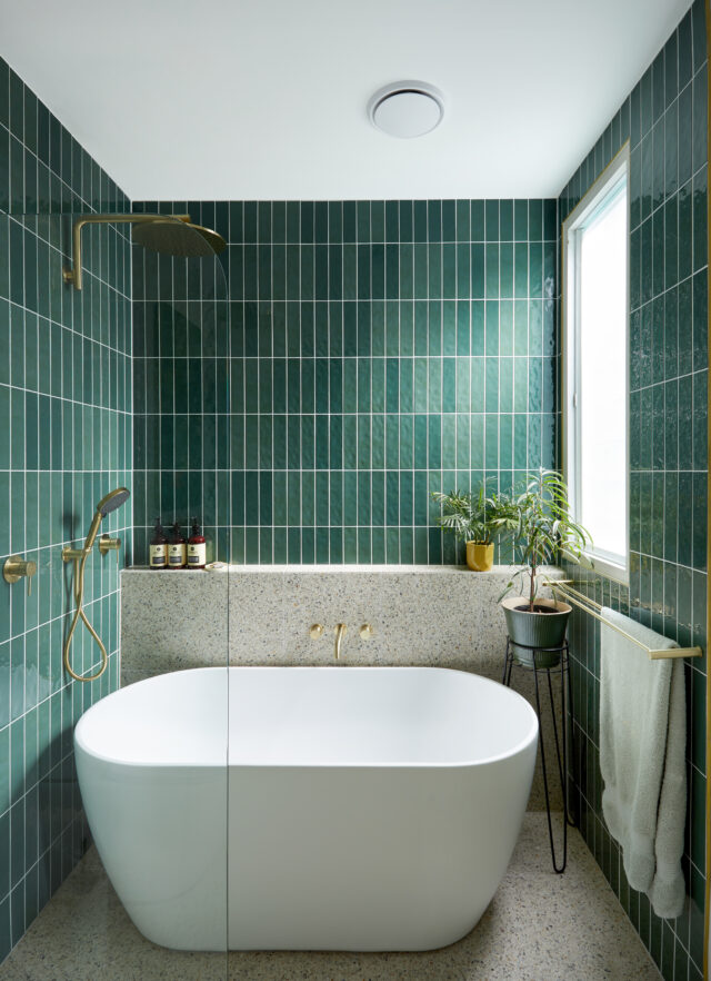

7. Consistency
When designing a renovation as a whole, one of the key elements is for all the spaces to have cohesion and consistency in the overall interior style. This means certain textures and colours will be repeated or presented in another way, room to room. That is why it is helpful to always start with the first tip in this post and can inform how you may choose to do this.
8. Lighting
Adding feature hanging lighting and or ambient lighting in the form of LED strips or wall lights is another opportunity to add a layer and pattern to a space. It is also another way to repeat a colour or honour a colour that might be in the space but not accentuated anywhere else.
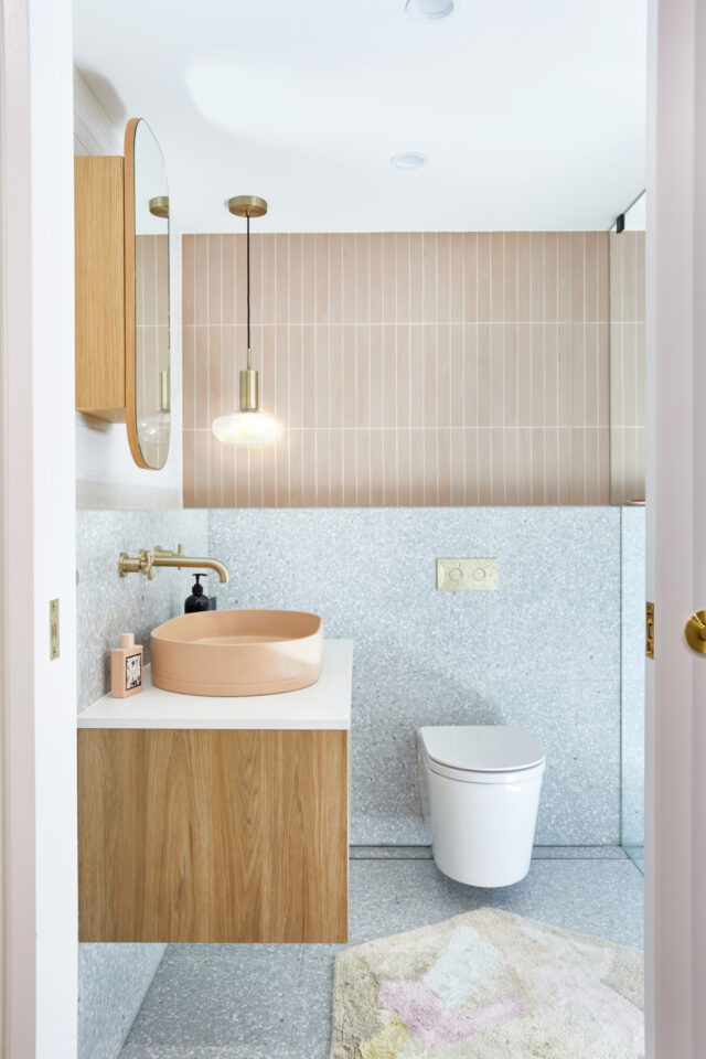

9. Hardware and fixture colours
Hardware on doors and cabinetry throughout a home is a perfect place to bring tip number 7 into practice. It can be an opportunity for potentially the colour of the tapware in your bathroom to match your door hardware etc. Cabinetry hardware is fast becoming a tool to add pattern and visual interest to any interior, lifting the face of any cabinetry.
10. Have fun!
Easier said than done when planning a renovation I know, but it is important to have fun and not let the fear of using colour hold you back or make you back out! If you believe in your choices and use these tips, you can create fun spaces that have your home feeling contemporary and personal all at the same time.
My favourite suppliers for unique products that add colour and pattern are Nood Co, Polytec, Parisi, ABI Interiors, Di Lorenzo Tiles, Lo and Co Interiors, CDK Stone and Vanity Co.
-Jeanette Del Zio is the director of JDZ Designs

